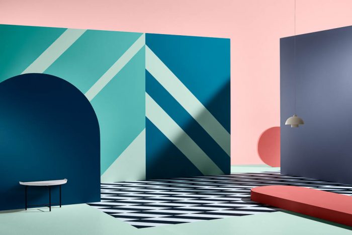
ESCAPADE palette featuring Dulux Sir Edmund, Cuticle Pink and Mossburn Styling by Bree Leech and photography by Mike Baker
This is always a favourite part of my year – the Dulux Colour Forecast. Dulux NEVER fail to inspire with hue heavy imagery that will totally change the way you think of colour and how to use it in our spaces. Nicely umbrellaed under the word BALANCE, each of the four palettes takes cues from the world around us, the latest in design and social happenings and form a solid story of curated themes – Essential, Kinship, Escapade and Reflect.
“Balance is desired in many areas of our lives, whether it be at work, at home with family, our lifestyle or simply within ourself. With future interiors in mind, the idea of balance is crucial to ensure we live and work in harmonious spaces that help to stimulate our senses, as well as enabling us to relax and retreat”
Each year there’s usually one pretty strong theme that you tend to warm to immediately and for me it would have to be ESCAPADE, but gradually as you learn about each theme you slowly start to fall in love with new colours and combinations that give unlimited possibilities to interiors which is incredibly exciting.
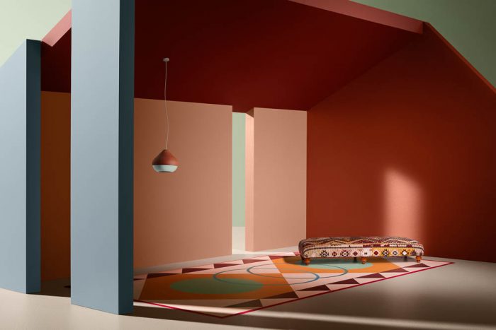
ESCAPADE palette using Dulux Bondi Pink and St Edmund | Styled by Bree Leech and Photographed by Lisa Cohen | Pouf by Poliform, Divider from Global West, Quilt Cover Set from Linen House, Fitted Sheets and Pea Cushion by Kip and Co, Pendant Light from Space, Side Table from District, Brass Lamp from House of Orange, Artwork by Ben Craven, Mirror and Jewellery Box from Designstuff
The ESCAPADE colour palette immediately takes you to warm days sitting poolside in Palm Springs with minty blues (Dulux Waitiki Landing and Manu Bay) and lolly pinks (Dulux Friends and Cuticle Pink). It’s all about the quest for fun and adventure.
There’s a fun loving quality to these this colour palette that offers up a huge dose of feel good factor which feels spontaneous and up beat – it certainly lifts the soul and brings out that sense of fun and holidays. We know how good a vacation feels so there really is no excuse not to bring this feeling into our homes.
This scheme also allows for organic forms to works alongside more solid structures – a heady mix that creates spaces that take you away to someplace special. These colours and ideas bring destinations to you and your home. Staycation – yes please.
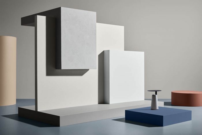
ESSENTIAL palette using Dulux Gnu Tan, Suede Effect Century Mist, Dieskau, Terrace White, Flooded Gum, Little Shoal Bay and Clay Court | Styled by Bree Leech and Photographed by Mike Baker
The ESSENTIAL palette immediately lowers the noise and sets a scene for simplicity and softness. An ode to natural textures, it champions muted shades as well as stronger tones like browns (Dulux Gnu Tan and Clay Court) and blues (Dulux Little Shoal Bay and Adele Island). They have even added a very natural pink to help compliment these tones (Dulux Mornington Half) which I am already falling hard for.
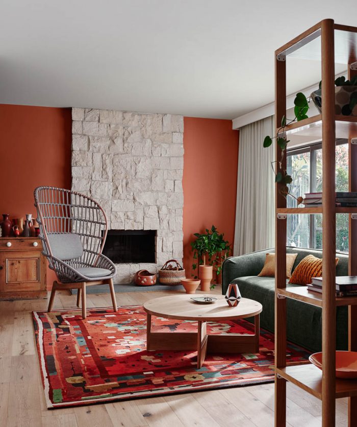
ESSENTIAL palette using Dulux Gnu Tan and Spanish Olive | Styled by Bree Leech and Photographed by Lisa Cohen | Chair and Coffee Table by Hub, Rug by Halcyon lake, Vase by Scout House and Bronze dish by Henry Wilson
It’s neutral but with a colourful edge that reminds us that we are allowed to put colour onto walls and that’s it’s not all about being loud and saturated to make a design statement. This has impact just by being soft, natural and present in the space. It allows us to feel like we can slow down and reconnect with spaces like never before. It’s instant mindfulness through colours and design.
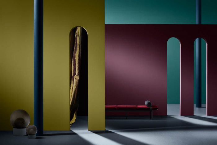
KINSHIP palette using Dulux Motueka, Tikitiki, and Very Terracotta | Styled by Bree Leech and Photographed by Mike Baker
The KINSHIP palette takes us to another place entirely. These colours take us back to not just our roots but connects us with the world. They remind us that we are a global community which can be reflected in our home spaces. With much social unrest and global uncertainty it’s nice to feel a sense of place and the feeling of being home. This palette most definitely offers us this.
Bringing these colours into your current realm is a intimate nod to the power of tribes, family and community. It’s a real celebration of traditional folklore and cultural diversity which can’t be ignored, so instead should be embraced. A big hug around the world.
KINSHIP palette using Dulux Very Terracotta and Cardrona | Styled by Bree Leech and Photographed by Lisa Cohen | Armchair by Mobilia, Rug from Halcyon Lake, Coffee Table by Apparentt, Sofa from Voyager, Cushions from Figgoscope, Vase from Modern Times, Ceramic Vessel and basket from Kazari, Set of Terracotta Pots from Hub
What I loves about this palette is the askew colours – different version of the regulars. The subtle blue (Dulux Ruski), the grubby green (Dulux Herbalist), the orange toned pink (Dulux Maiko) and the bright mustard (Dulux Fortrose). These colours feel new – they feel exciting and offbeat and I personally can’t wait to try these in some new spaces. I also think I have a new favourite red (Dulux Outrageous Red)
REFLECT palette features Dulux Ohaupo, Amazon Queen and Martinborough | Styled by Bree Leech and photographed by Mike Baker
The REFLECT palette is the colour equivalent to ‘tipping our hats’ to the past, especially the 70’s with large helpings of the 90’s. Modern day has really got us very involved in a smart and technological world and this palette is our chance to help us find greater meaning in what we choose to surround ourselves with.
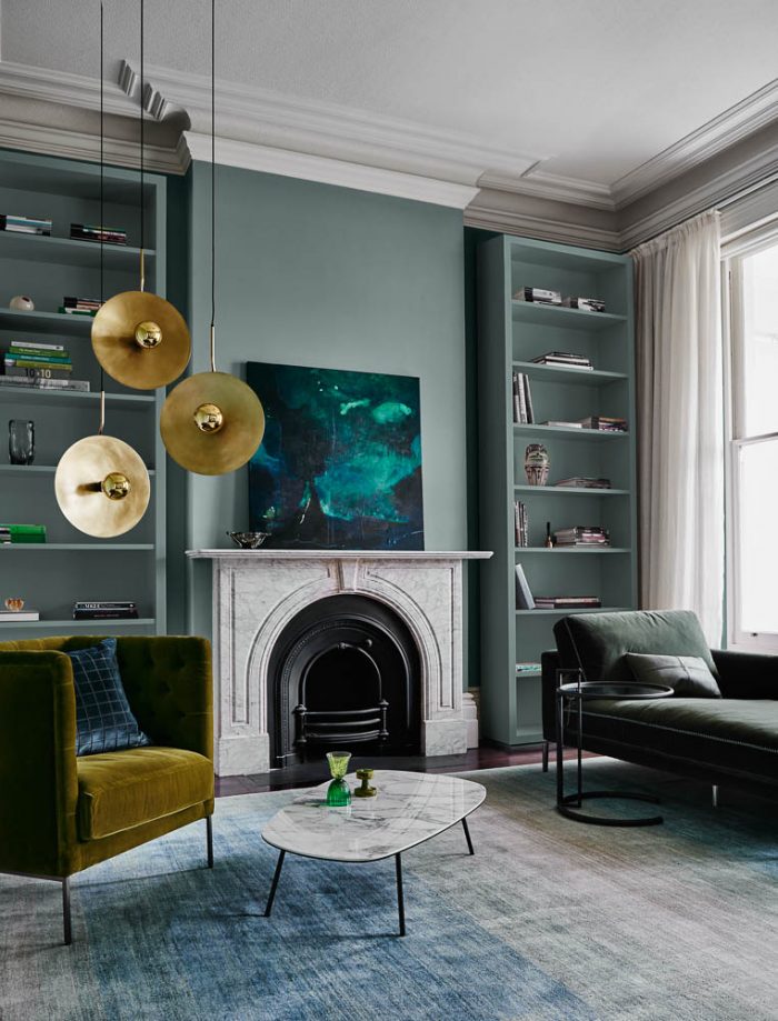
REFLECT palette using Dulux Goyder Green | Styled by Bree Leech and photographed by Lisa Cohen | Armchair by Space, Chaise and Coffee Table by Voyager, Pendant Light by Statelight, Artwork by Stefan Gevers, Cushions by Zuster, Rug by Behruz Studio, Side table by Anibou, Glass on table by Franque
The colours range from pigment rich greens (Dulux Goyder Green, Wiroa Island and Amazon Queen) to a display purple based pinks (Dulux Smokey Quartz and Morikau) and mauves (Dulux Martinborough), right into a dense purple (Dulux Nugget Point). There’s going to be no problem finding a favourite mix of colours that will bring back memories from the past as well as creating new ones to take you into the future.
++++++++++++++++++++++++++++++++++++++++++++++++++++++++++++++++++++
All of these images are really only a snippet of what Dulux are doing with the 2018 forecast, infact they have given a plethora of imagery, which you can get your own inspiration from, in the e-magzines that are out now.
From matching whites to each trend, to well known designers making their own palette choices, suggestions of schemes we can try and paint tips – these mags are such a great reasource for us all to use.
Definitely number 3- For some reason, I thought of you.
Have a great week, Will 🙂