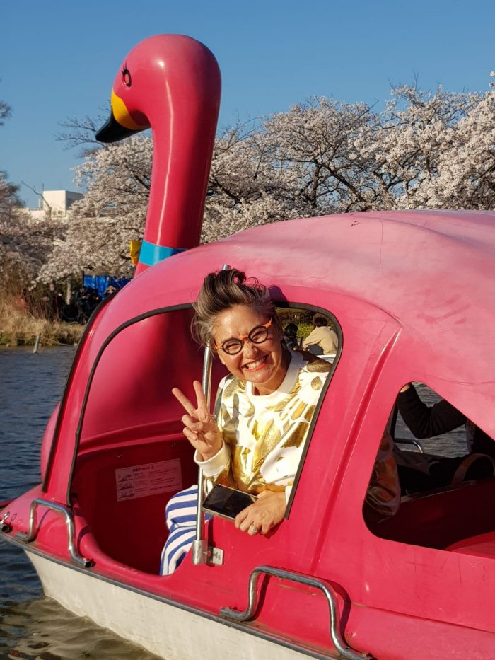
SWAN BOATS! One of my favourite things to do ever! Image by Alex Fulton Design
There are two parts to my Tokyo trip – the first week was all about design and the second was about family. The first week was with a group of fellow design lovers led by the formidable and glorious Megan Morton. This post will break down all the good bits (and there were many) and share all the joy of Tokyo.
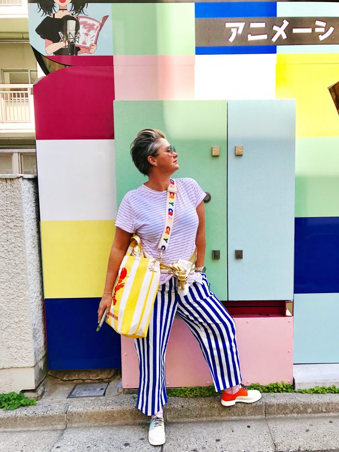
Colourful streets of Tokyo | Image by Alex Fulton Design
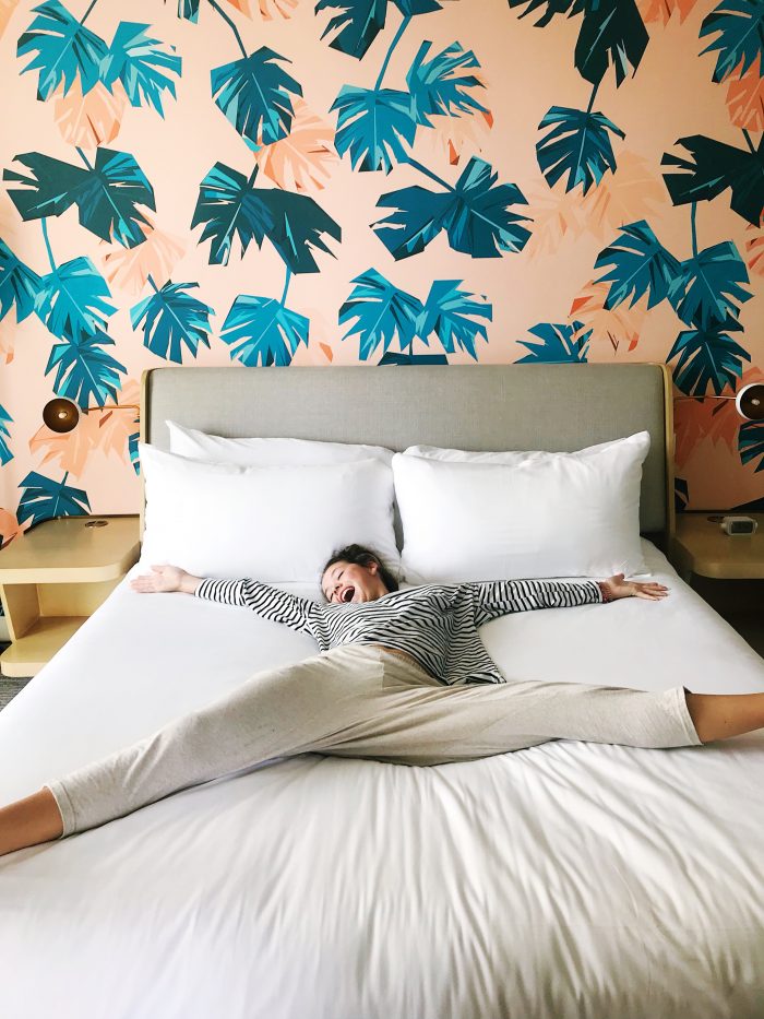
To Stay:
+ Centurion Classic in Akasaka
+ Hotel Niwa in Chiyoda-ku
+ Trunk (Hotel) in Shibuya
+ Book and Bed in Shinjuku
+ Artist Hotel – BnA Studio in Akihabara
+ 9 Hours (Capsule Hotel) in Shinjuku North
+ Sheraton Grande Tokyo Bay Hotel (excellent for Disneyland and Disney Sea)
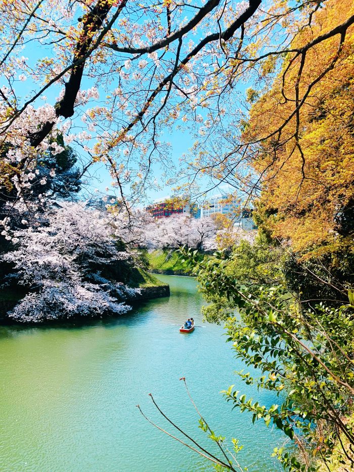
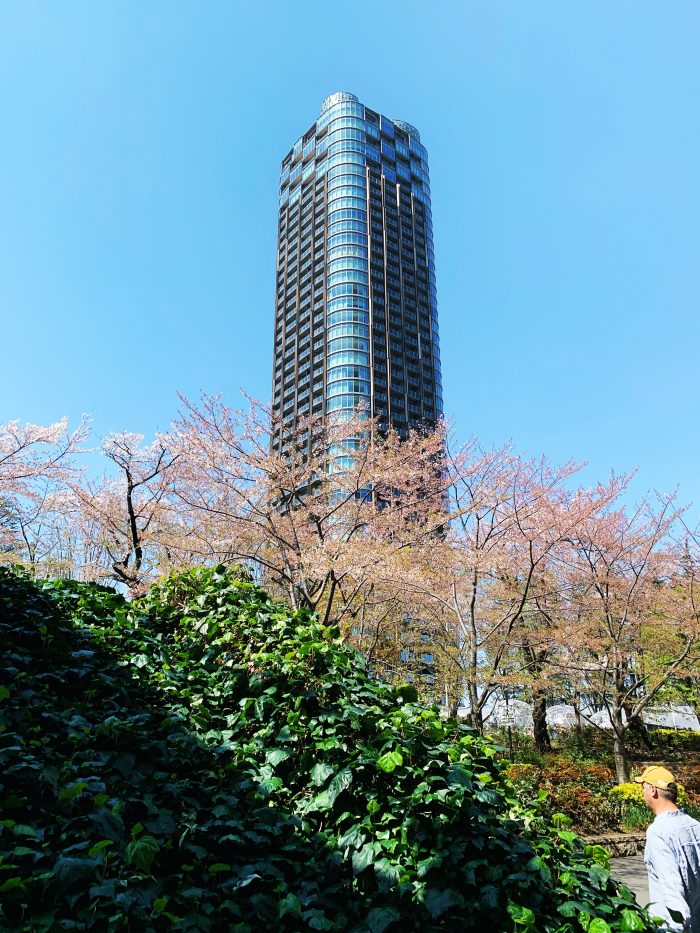
Sakura City – Tokyo was full of blossoms | Image by Alex Fulton Design
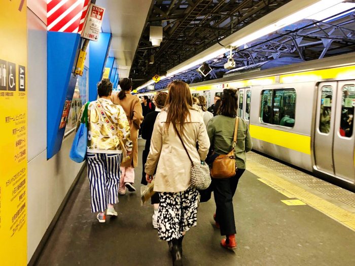
The Tokyo Metro | Image by Alex Fulton Design
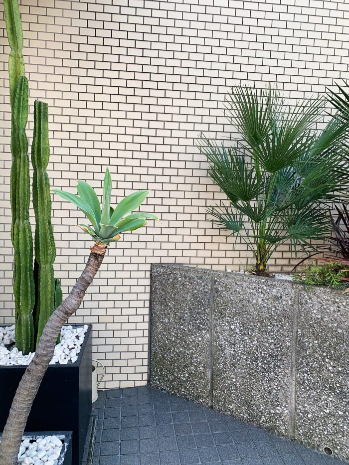
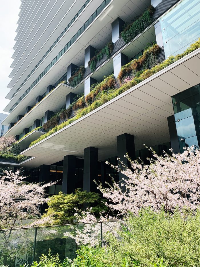
Exterior garden in Tokyo | Image by Alex Fulton Design
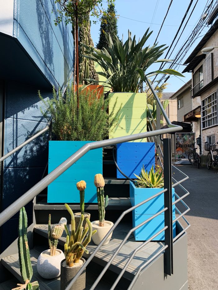
Stair gardens in Harajuku | Image by Alex Fulton Design
Staying in the ‘right’ place can be a bit of stab in the dark when you are looking at a map of Tokyo, but the good news is there are some great areas and there is such a super Metro system that you are generally covered to use your accom as a base and go from there. I would suggest Shinjuku and Ikebukuro (Toyko’s largest train station and full of nightlife), Ginza and Tsukiji (Polished neighbourhood), Shibuya (Heart of youth culture) and Akasaka and Roppongi (Cutting edge art and design) as they are all very central and easy to go places from. Taxi’s can be expensive going long distances and we only really used them at the end of the day or if it was raining. Even then the Metro was a better option in the rain as taxi’s were in high demand.
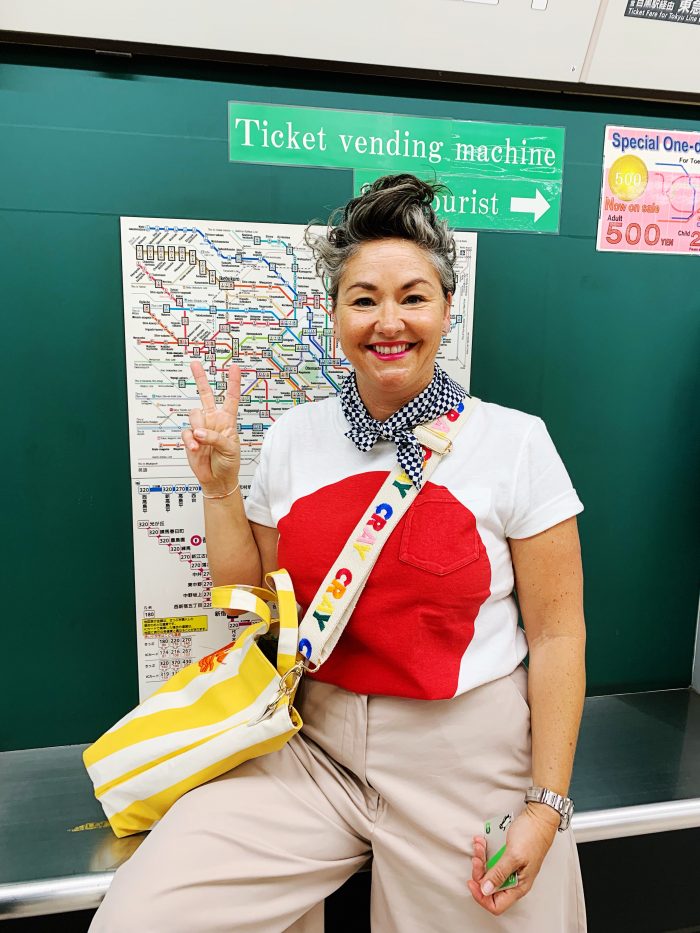
At first I was a little scared of the Metro but after buying my first Pasmo card, loaded on some money, I was off! Google maps walks you through how to get from point A to point B, so easy using the public transport option. Easy Peasy. By the end of two weeks it was a doddle!
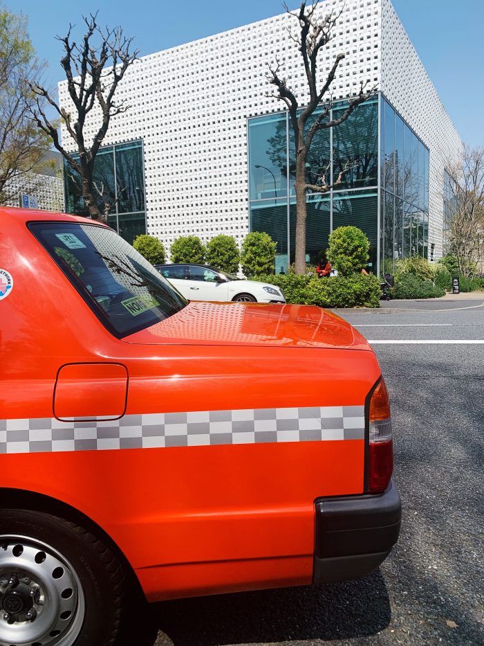
Tokyo Taxi | Image by Alex Fulton Design
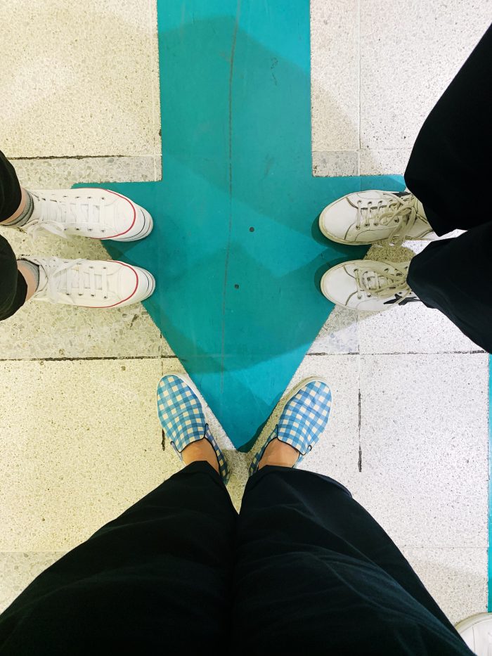
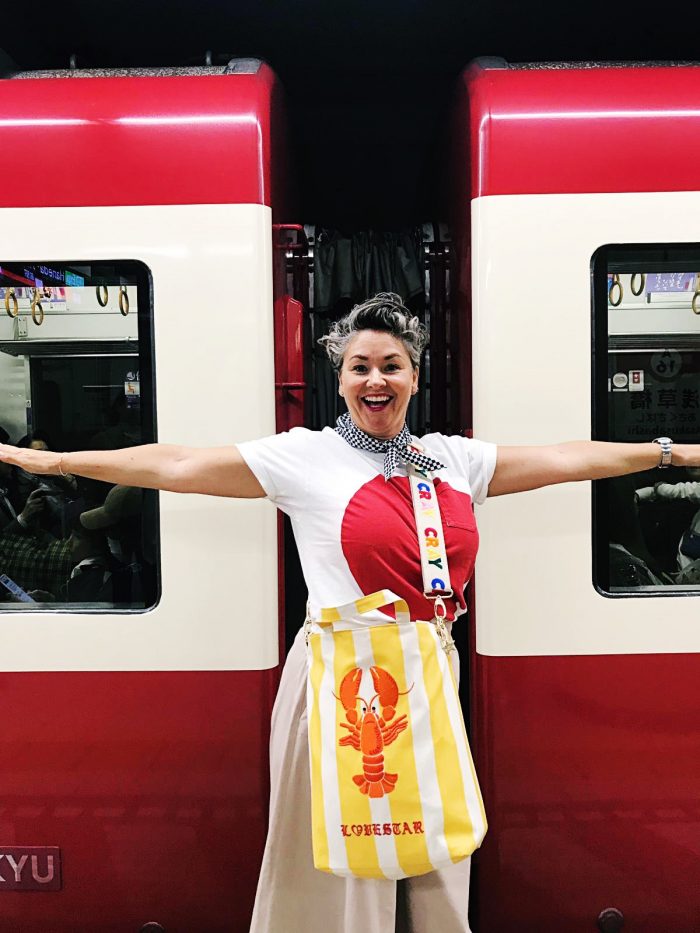
Waiting for the Metro Trains
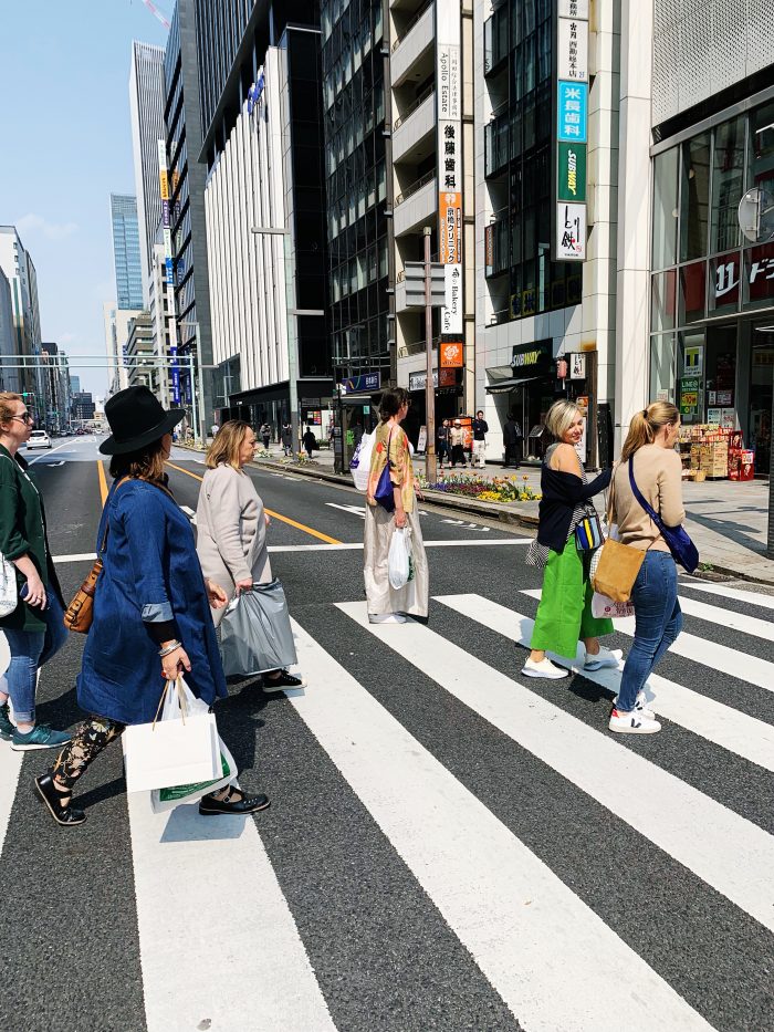
Blossoms in Ginza | Image by Alex Fulton Design
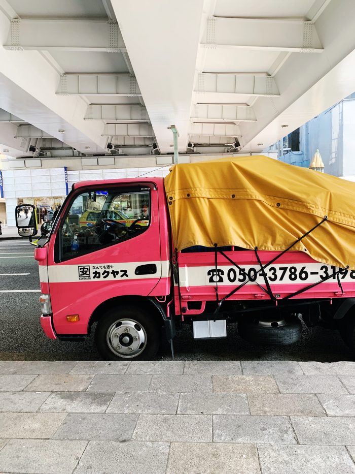
Pretty Rubbish Trucks | Image by Alex Fulton Design
The first week we stayed at Hotel Niwa which highlights included an excellent breakfast buffet, communal massage chairs and great staff. The gym was rubbish but after 20,000 steps a day I found I gave up on that idea pretty quickly. Gym Schym.
The second week was at the Centurion Classic in Akasaka. This is a great area with many supermarkets and foodie joints that satisfied day trip exhaustion. The staff bowed when you entered and left and the foyer was a favourite place to Photo Booth moments. Our room was a traditional space with rice paper screens, traditional flooring, futons and closed in bunk beds for the girls. We also had two in room massage chairs (bonus and very well used) and a cooling unit that you stand on to ‘refresh’ your body. Mental note to google one so I can have a little ‘Tokyo’ at home!
The other hotels I’ve mentioned are ones that were recommended and my fellow design-mates stayed at.
The Design Chasers in Ginza | Image by Alex Fulton Design
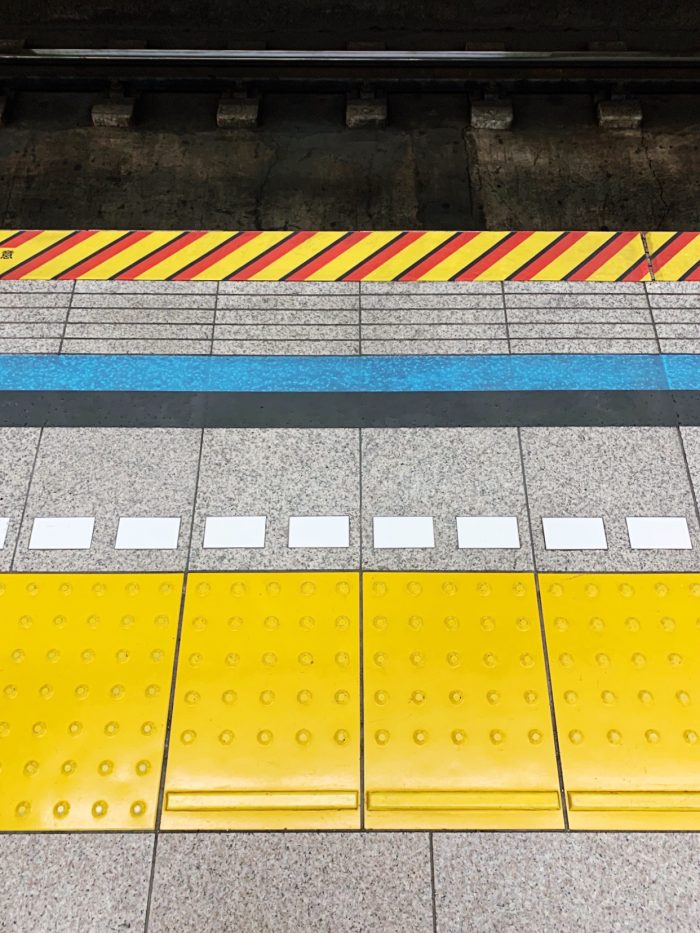
Subway patterns | Image by Alex Fulton Design
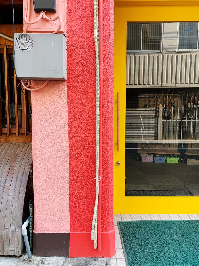
Street colours | Image by Alex Fulton Design
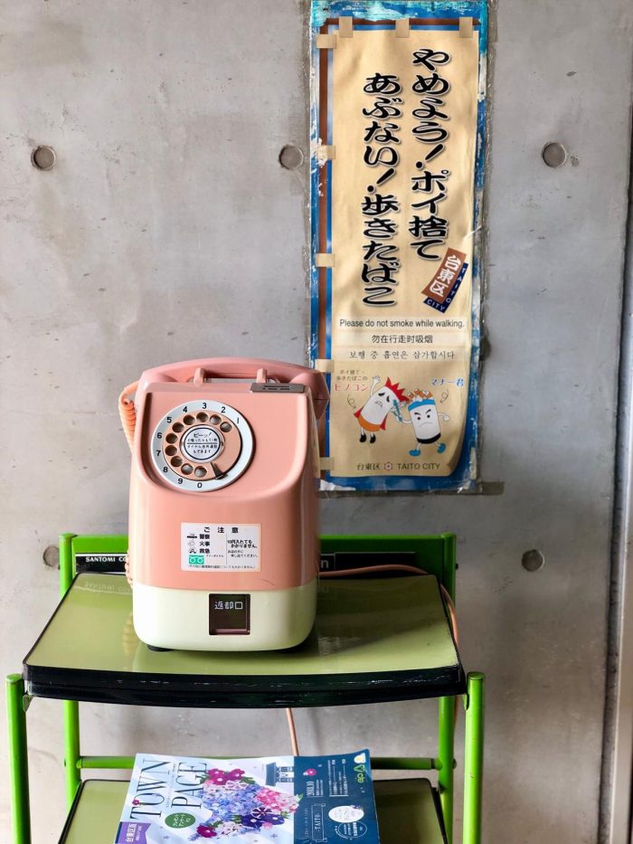
Pretty Payphones | Image by Alex Fulton Design
When you match the trains | Image by Alex Fulton Design
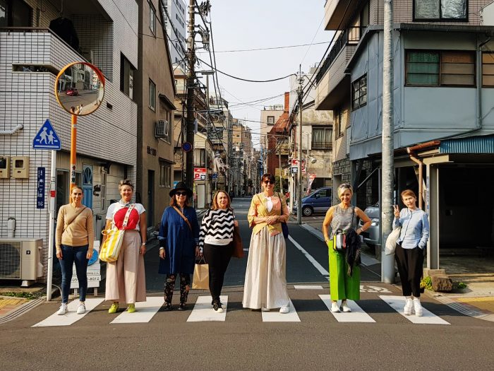
Design Team in Tokyo | Image by Alex Fulton Design
The many shades of Metro floors | Image by Alex Fulton Design
Changing skyline in Tokyo | Image by Alex Fulton Design
The foyer of our Hotel – Centurion Classic in Akasaka
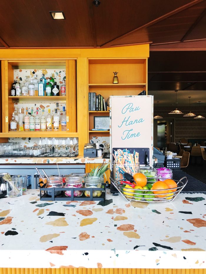
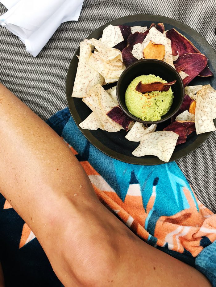
To Eat:
+ Vending machine Ramen (this is indeed one of life’s joys)
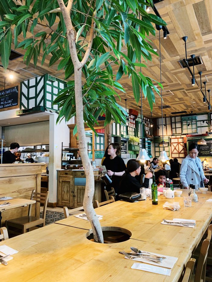
+ Bills (there are three in Tokyo) excellent coffee and Australian fare
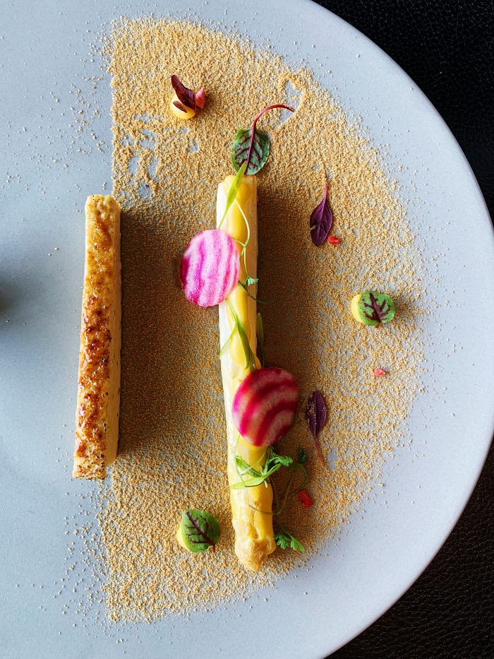
+ Moon Restaurant (Designer food)
+ Sakura Market Food (Only around when the blossoms are out)
+ Eddy’s Ice cream (Harajuku)
+ Luke’s Lobster
+ Lawson Super Mart (excellent food and drinks – great fun finding new favourites including heat up eye masks!)
+ Gonpachi Nishiazabu (Kill Bill Restaurant in Minato)
+ Ivy Place in Daikayama (Best fluffy pancakes!)
+ Le Pain Quotidien (Beautiful French bakery)
+ Higashuya (In Ginza, traditional Japanese fair in beautiful surroundings)
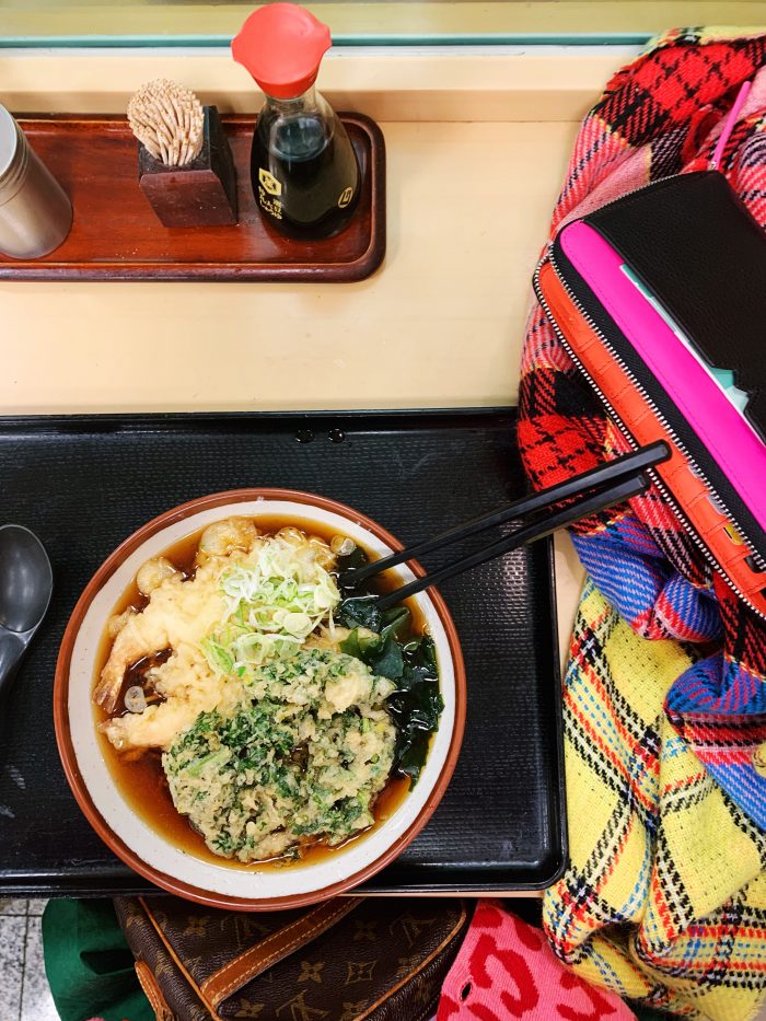
Vending Machine Ramen in Suidobashi | Image by Alex Fulton Design
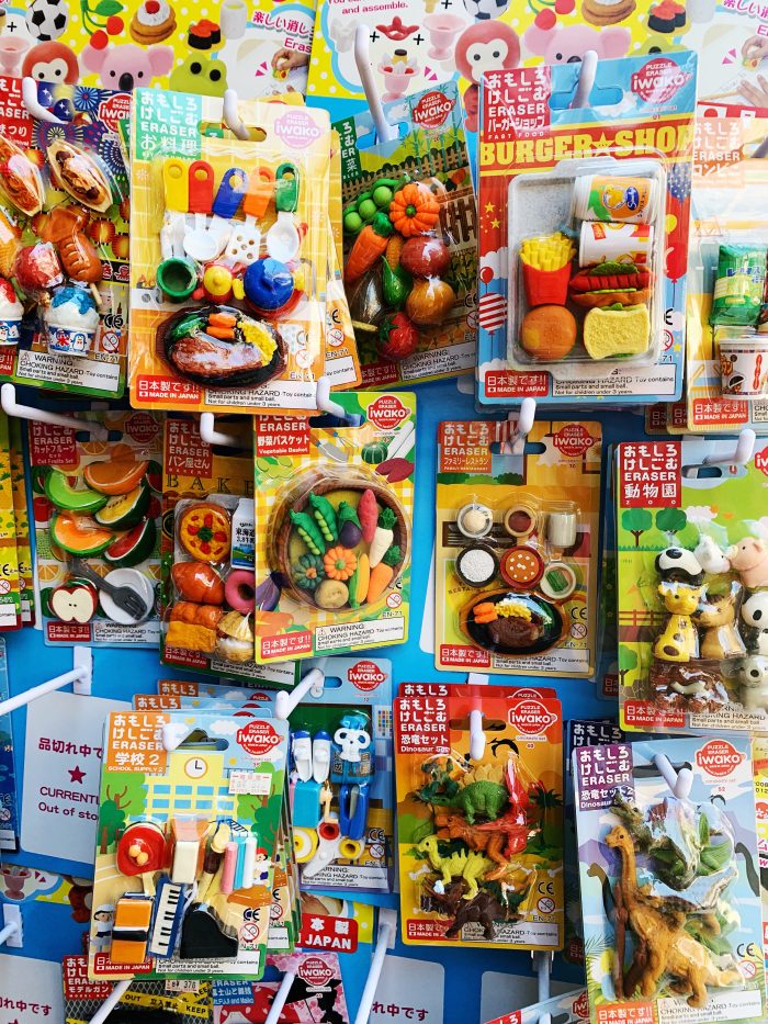
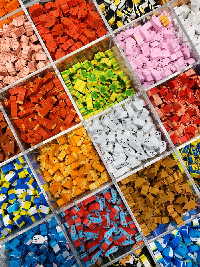
Food Erasers | Image by Alex Fulton Design
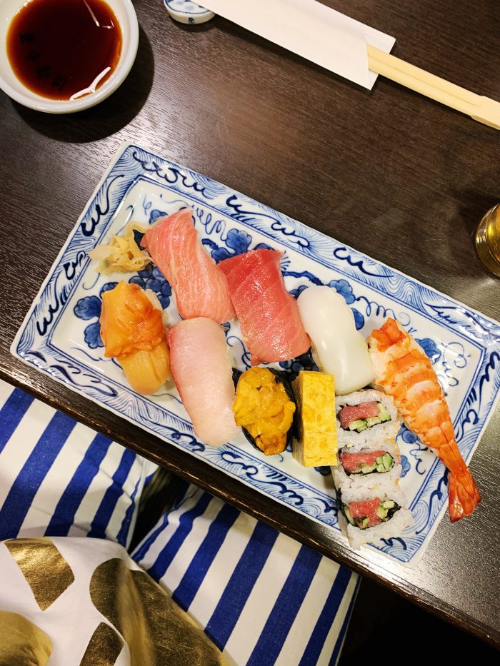
Real Sushi | Image by Alex Fulton Design
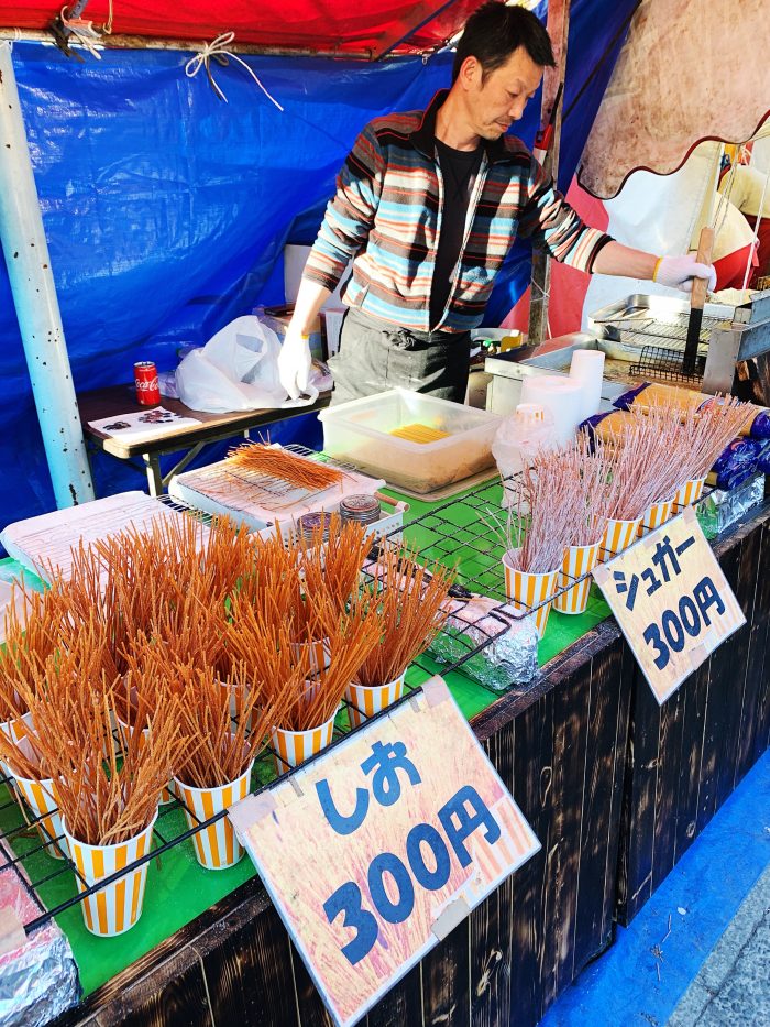
Sakura Market Food – Deep fried pasta in savoury or sweet | Image by Alex Fulton Design
I’m not really a foodie, but in Tokyo it was hard to separate food from design in most cases, as a lot of the food was so beautifully presented – from sushi to cream buns. I wanted to try everything (and we did!). The wee supermarkets were so fun to explore and try new and strange foods and we found some new favourites.
The Totoro Cream Puffs were a highlight – these wee cuties are in hot demand though with them selling out usually by 11am. If you want to get some ring and reserve a few a couple of days before – they are worth it.
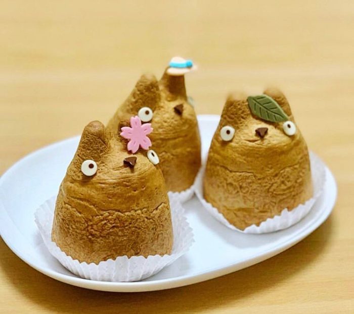
The cutest Totoro cream puffs ever! | Image by Alex Fulton Design
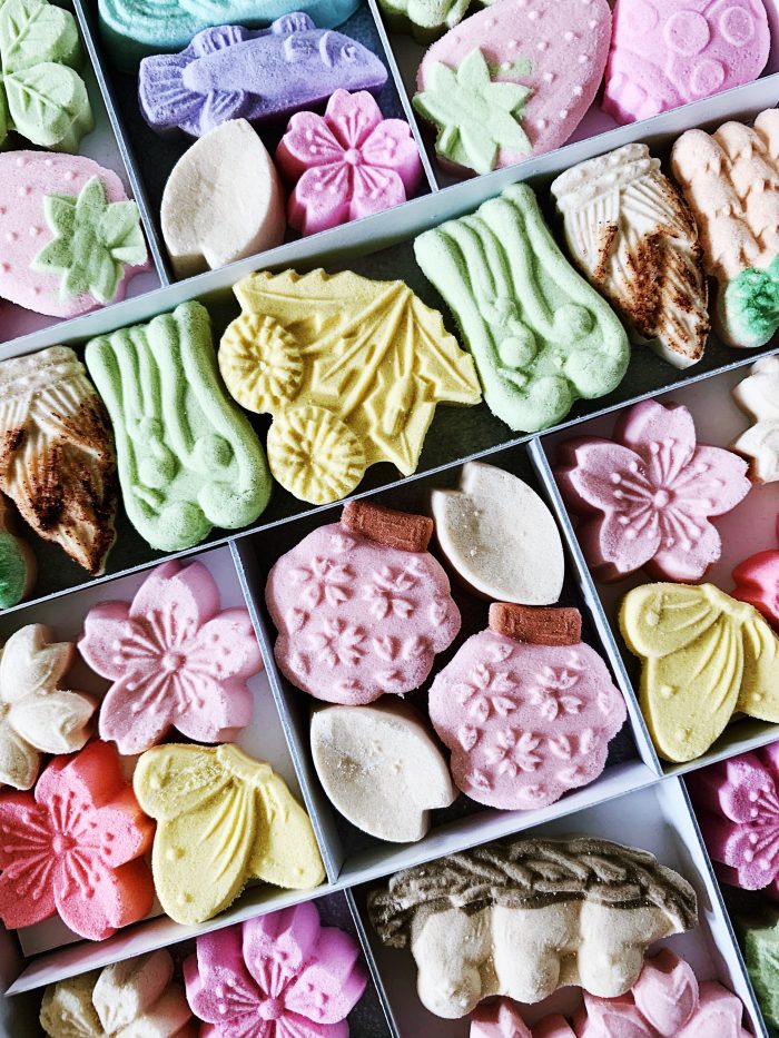
Wasanbon Higashi Sugar Sweets | Image by Alex Fulton Design
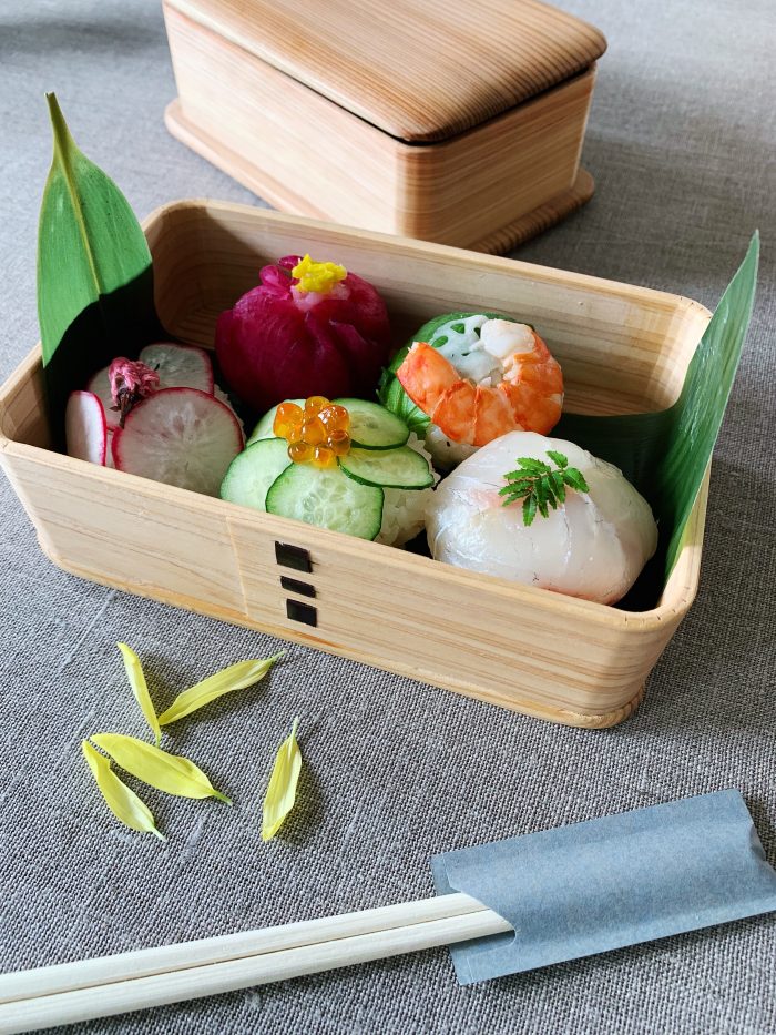
Making Sushi Rice balls | Image by Alex Fulton Design
Bills in Omotosando | Image by Alex Fulton Design
I loved the Japanese food but equally there was some excellent European options – We managed to visit 2 of the three Bills Restaurants (as in Australian Bill Granger) for a great coffee and yummy breakfast, lunch and dinners. Their Hotcakes are insane and are a must.
Lukes Lobster was another favourite – these hot soft rolls filled with meaty chunks of lobster were juicy and mouth wateringly good. Again they are in a few locations.
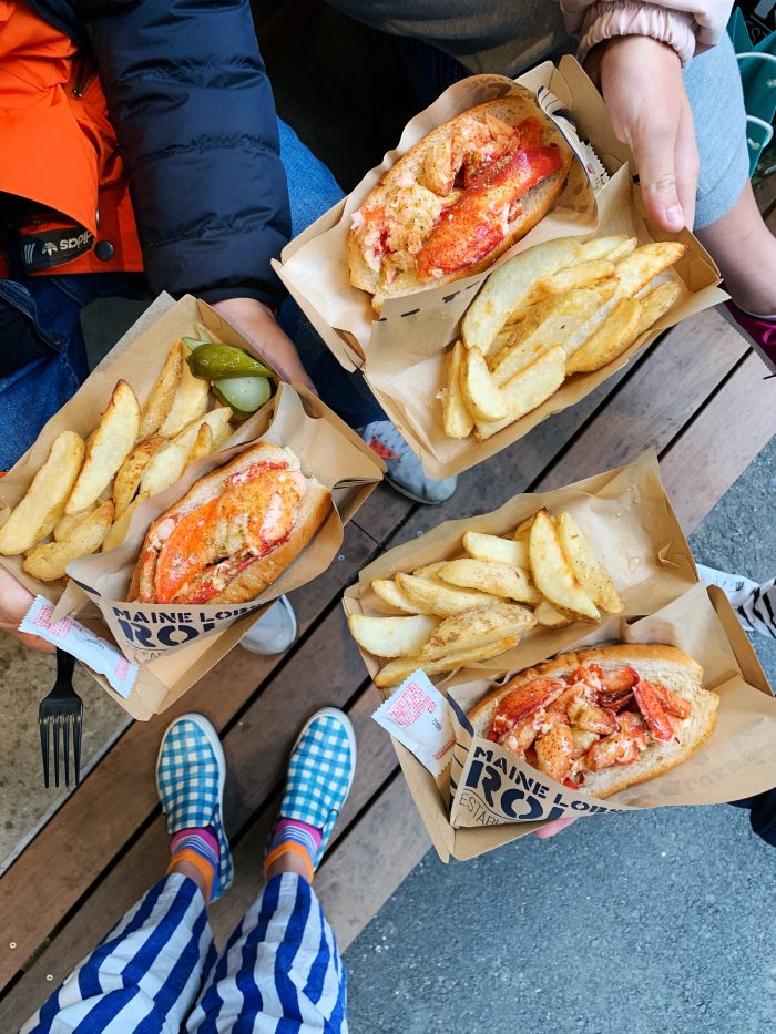
Luke’s Lobster in Shinjuku | Image by Alex Fulton Design
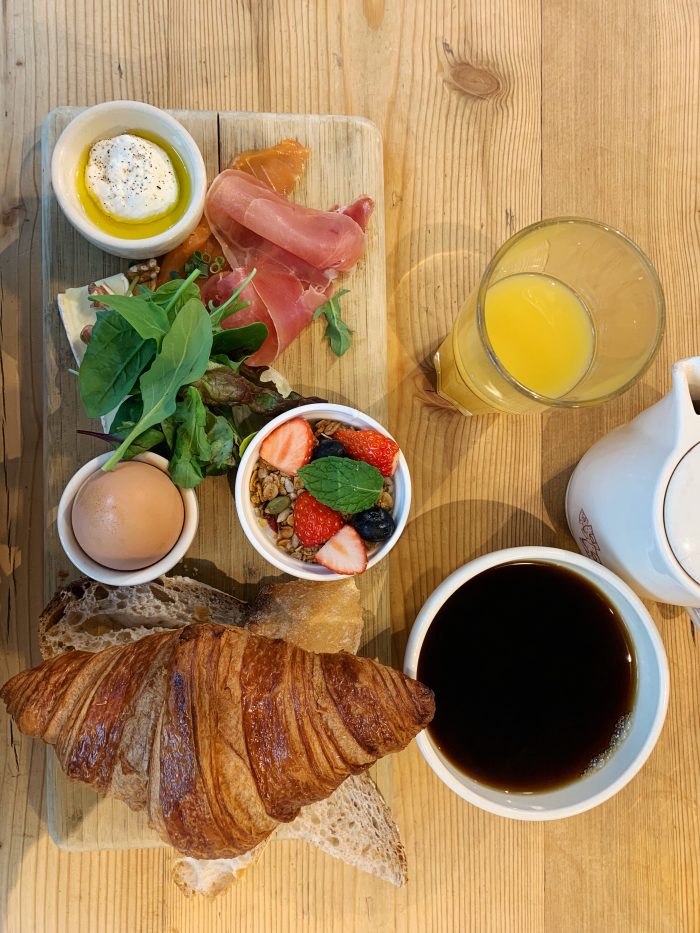
Le Pain Quotidien Breakfast – Best! | Image by Alex Fulton Design
Le Pain Quotidien Bakery – Best! | Image by Alex Fulton Design
Moon Restaurant Fine Dining at Rappongi Hills
As a wee treat we headed up the Mori Tower for Lunch at Moon Restaurant – it was a degestastional dream with beautiful presented high end food with an incredible view. After a 8 course meal we could walk it all off by visiting the musuem and art gallery based on the same floor.
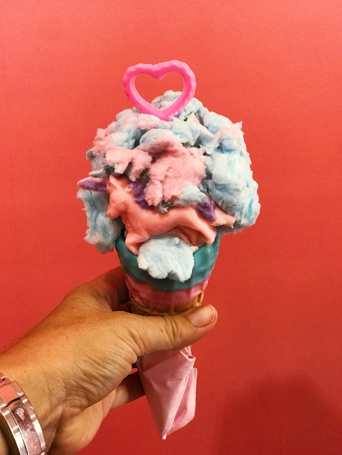
Eddy’s Ice Cream in Harajuku | Image by Alex Fulton Design
Dining at Disneyland | Image by Alex Fulton Design
To Do:
+ Poodle Cafe (In Harajuku – any animal cafe – hedgehog, owl, or cat! They are mostly based around this area – link HERE)
+ Blossoms! (Best time of the year to see them is end of April early March)
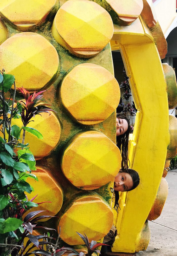
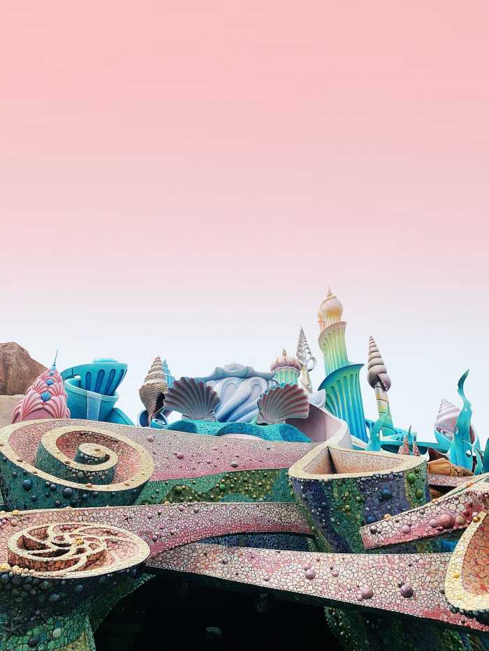
+ Swan Boats at Ueno Park
+ T Site (for amazing afternoon tea and mind blowing bookshop)
+ Robot Restaurant (I wouldn’t eat here but it’s a must for a full sensory experience)
+ Tokyo Dome Amusement Park (Highly recommend the karaoke Ferry wheel)
+ Scramble Crossing (In Shibuya – get a birds eye view from the various viewing spots)
+ Oedo Antique Market (In Chiyoda – Open first and third Sunday of each month)
+ Kitchen Street (In Kappabashi. Seeing is believing – there’s so much for your eyeballs here – look for the 3 teacups!)
+ Ink Stand (Taito City – Make your own Ink Colour)
+ Sumida Aquarium (At Tokyo Skytree)
+ 21 21 Design Gallery (In Roppongi)
+ Mori Art Museum (In Roppongi)
+ The Ramen Museum (in Shin-Yokohama)
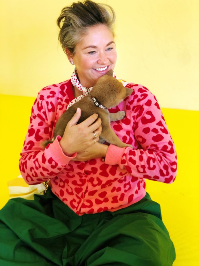
Harajuku Toy Poodle Cafe | Image by Alex Fulton Design
Local Signage for colour inspiration | Image by Alex Fulton Design
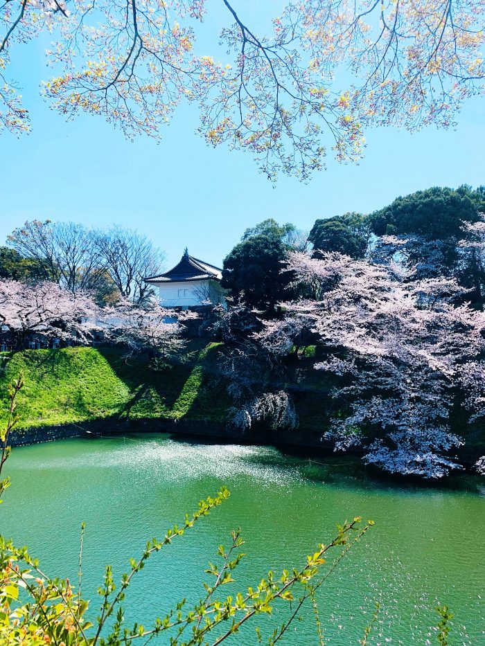
Blossoms at Nippon Budokan | Image by Alex Fulton Design
Finding colour in Omote-Sando | Image by Alex Fulton Design
Ok guys – you will need to plan your days as a lot of what we did was spread out all over Tokyo. Make sure you group together what you want to see (maybe only do two big things a day) and then plan your shopping and eating around the area you will be in. There’s an abundance of things to do for all ages and a lot of what we saw we stumbled across as there are so many exhibitions and events going on everywhere! This is especially true around blossom season, where everything is all about the ‘sakura’.
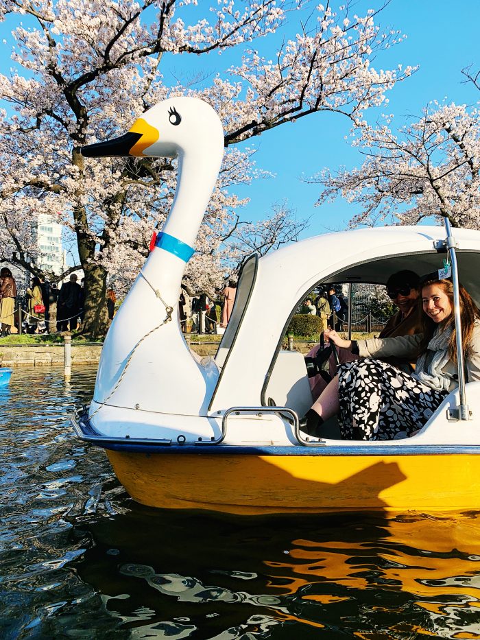
Swan boats at Ueno Onshi Park | Image by Alex Fulton Design
The Jesus Rafael Soto Penetrable BBL Bleu at Louis Vuitton | Image by Alex Fulton Design
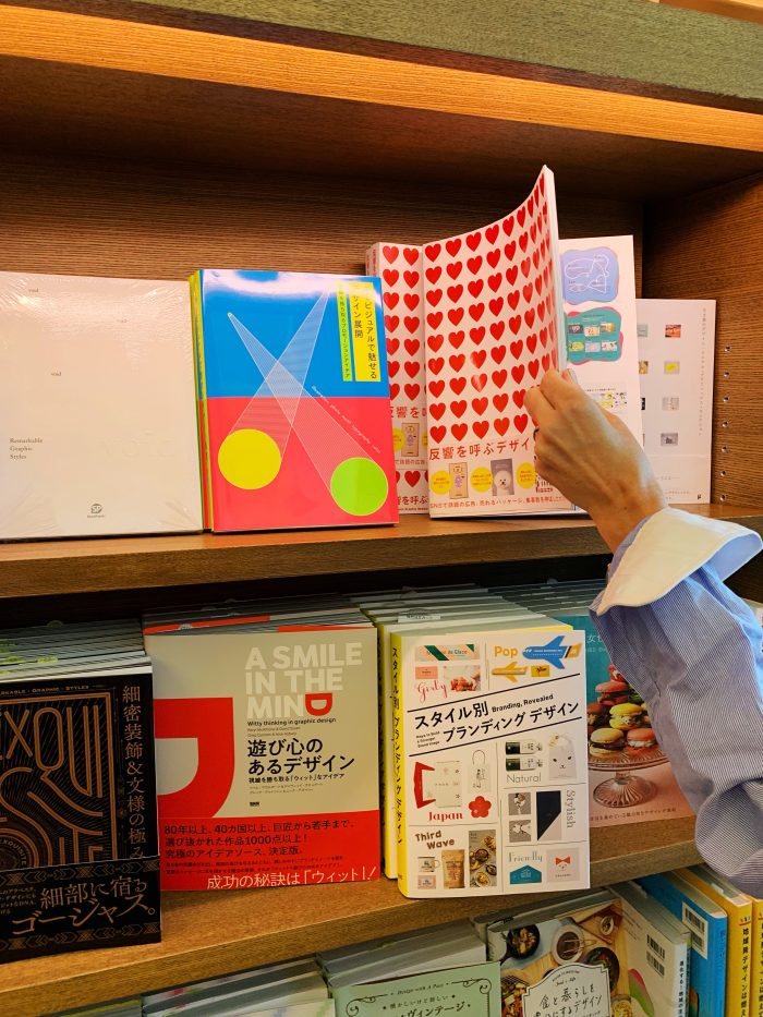
Book Shop at T-Site in Daikanyama | Image by Alex Fulton Design
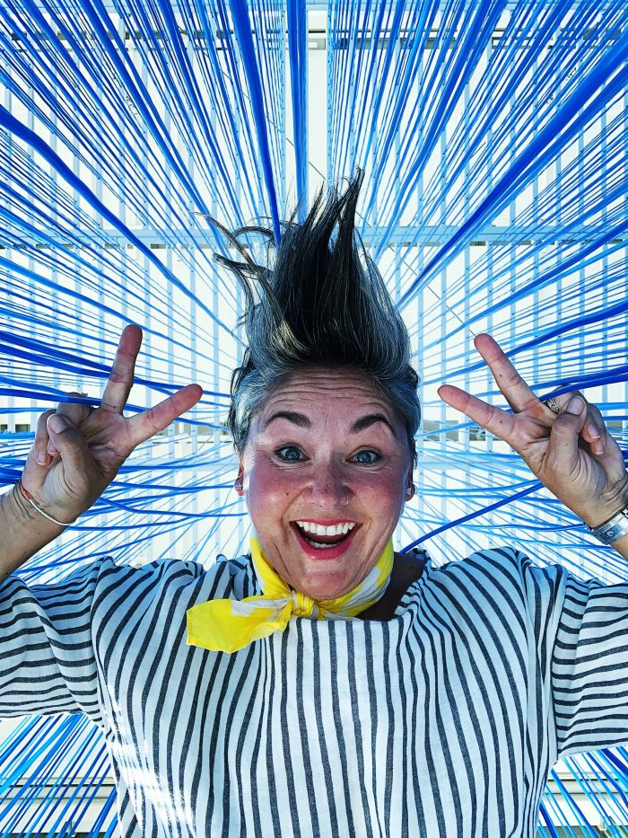
Make sure you book in online a session in one of the Teamlab exhibitions – they will blow your mind. They are full sensory experience with lights, water, touch and visual images. Its hard to explain, but worth taking the time to see.
The Sumida Aquarium which is located next to the Sky Tree was a lovely retreat from the hustle and bustle of busy streets and a great place to take some time out. After that we decided to head up the Sky Tree which is the highest tower (634km) in Tokyo, infant the world, and yes we paid extra to not go in the queue and it was well worth it! You still had to queue to go down, but the views! We could clearly see Mt Fuji which is surprisingly close to Tokyo (and a day trip away).
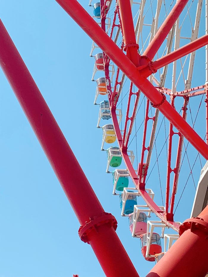
Ferris Wheel at Tokyo Port | Image by Alex Fulton Design
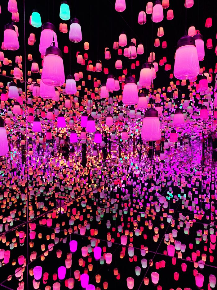
TeamLab Bordalis Lantern Room | Image by Alex Fulton Design
So Japaneseie | Image by Alex Fulton Design
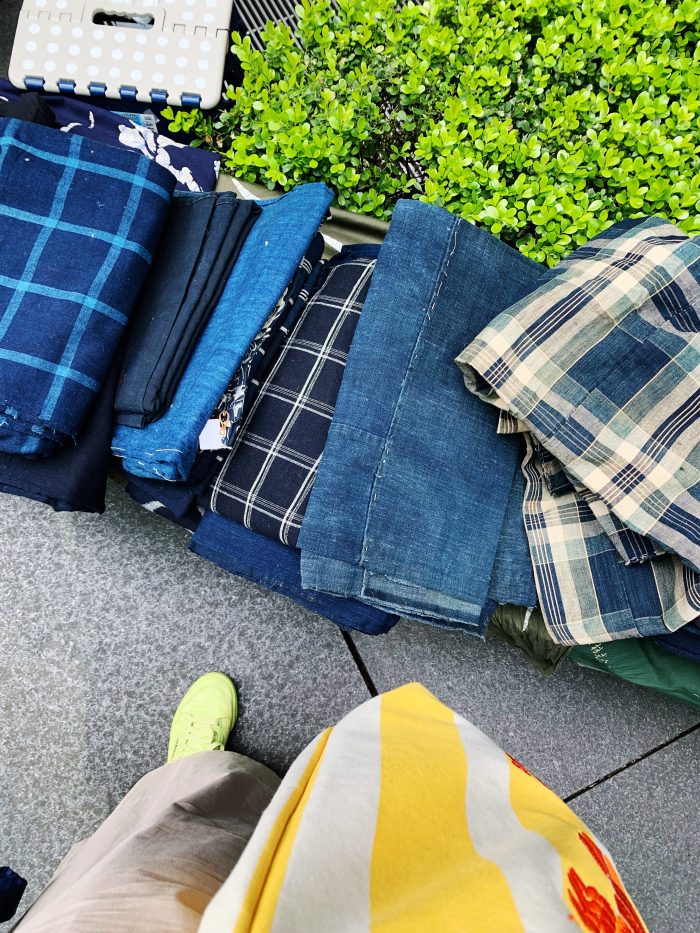
Fabric at the Odeo Antique Market
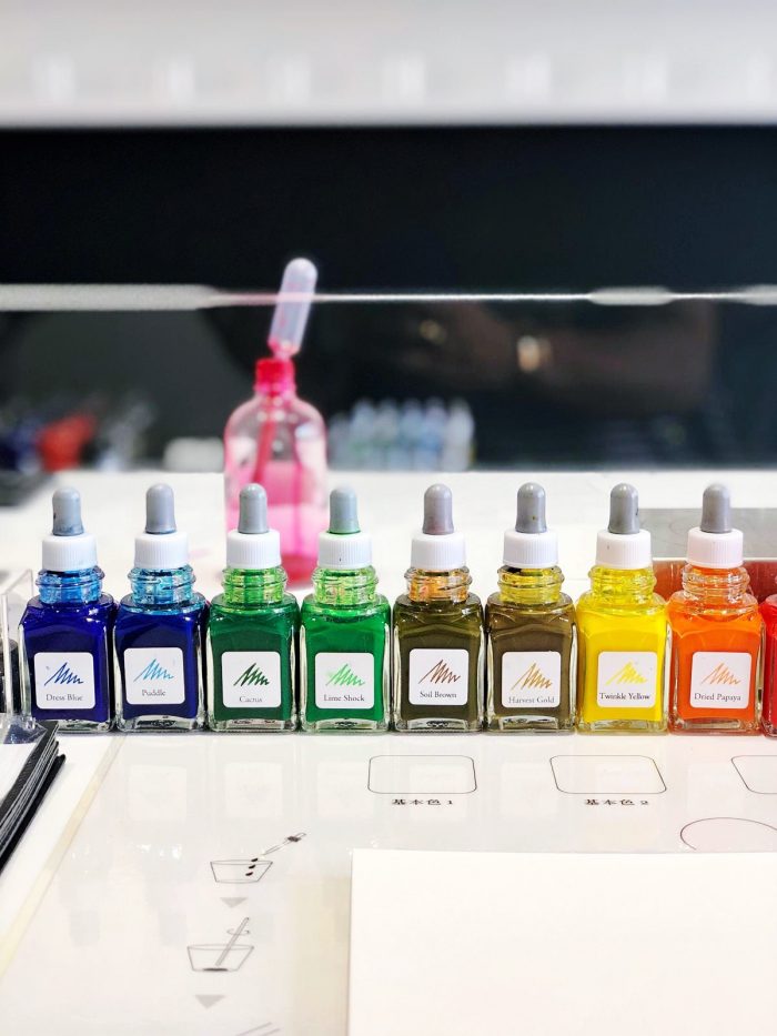
Making our own ink at Ink stand
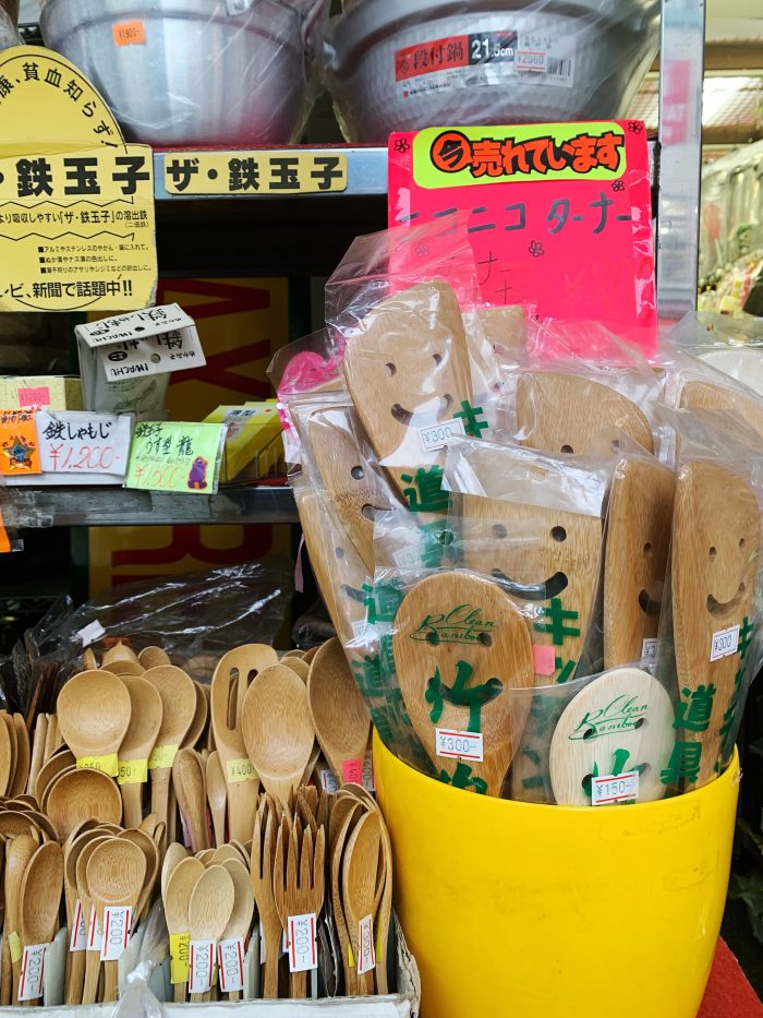
Kitchen Street in Kappabashi | Image by Alex Fulton Design
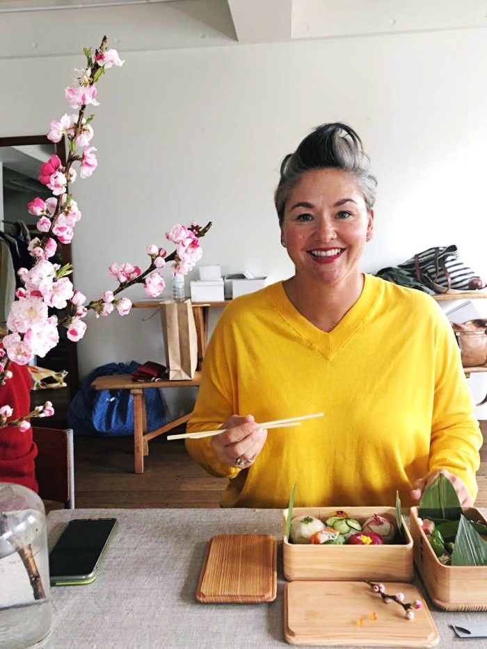
Sushi Cooking Class | Image by Alex Fulton Design
Sumida Aquarium at Sky Tree
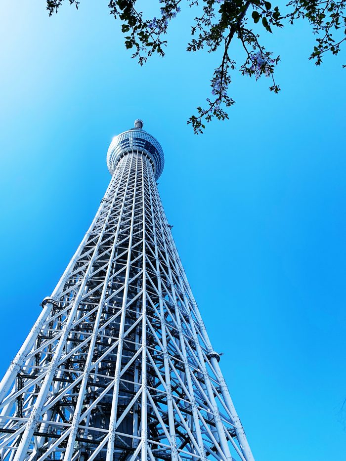
Tokyo’s Sky Tree – the highest tower in the world | Image by Alex Fulton Design
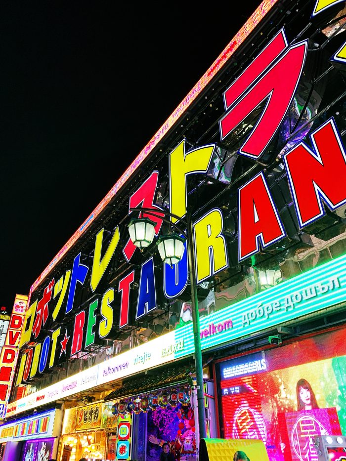
Robot Restaurant in Shinjuku | Image by Alex Fulton Design
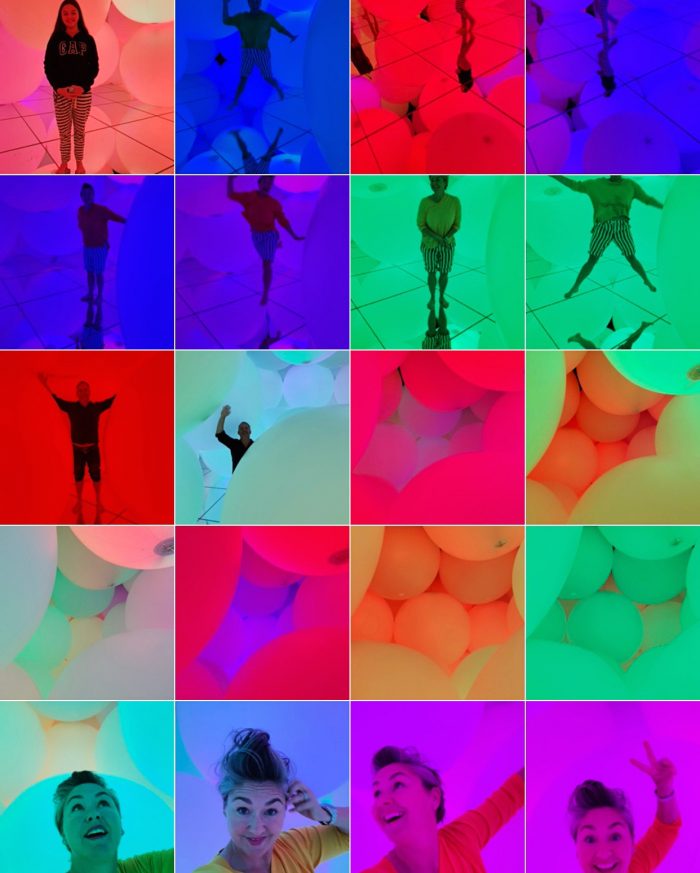
Teamlab Planets | Image by Alex Fulton Design
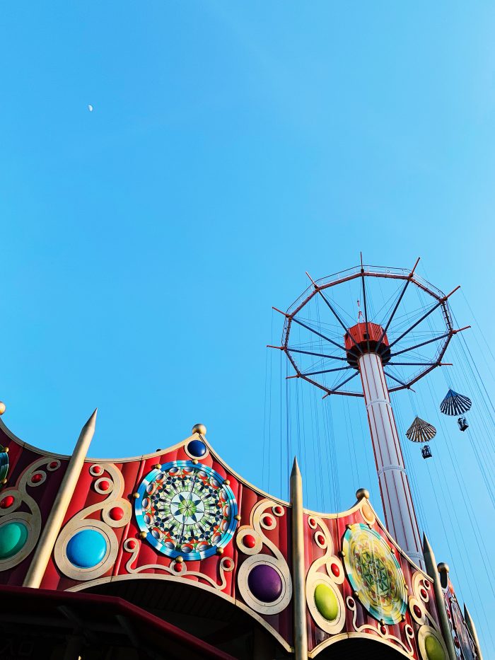
Adventure park at Tokyo Dome | Image by Alex Fulton Design
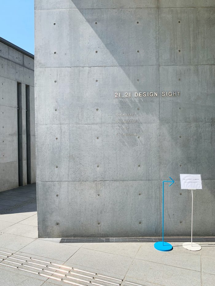
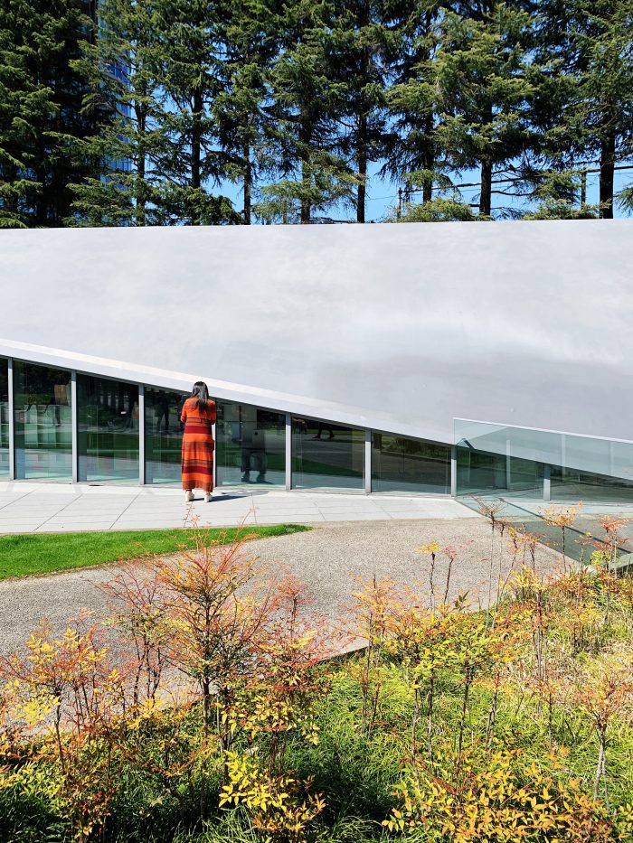
21 21 Design Art Gallery | Image by Alex Fulton Design
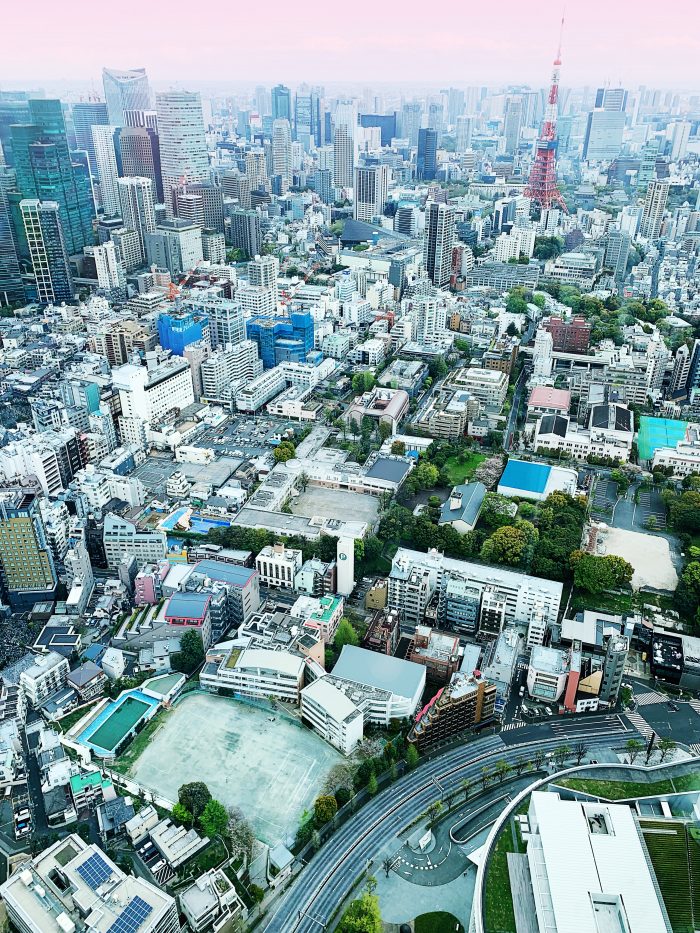
View from the top of Mori Tower
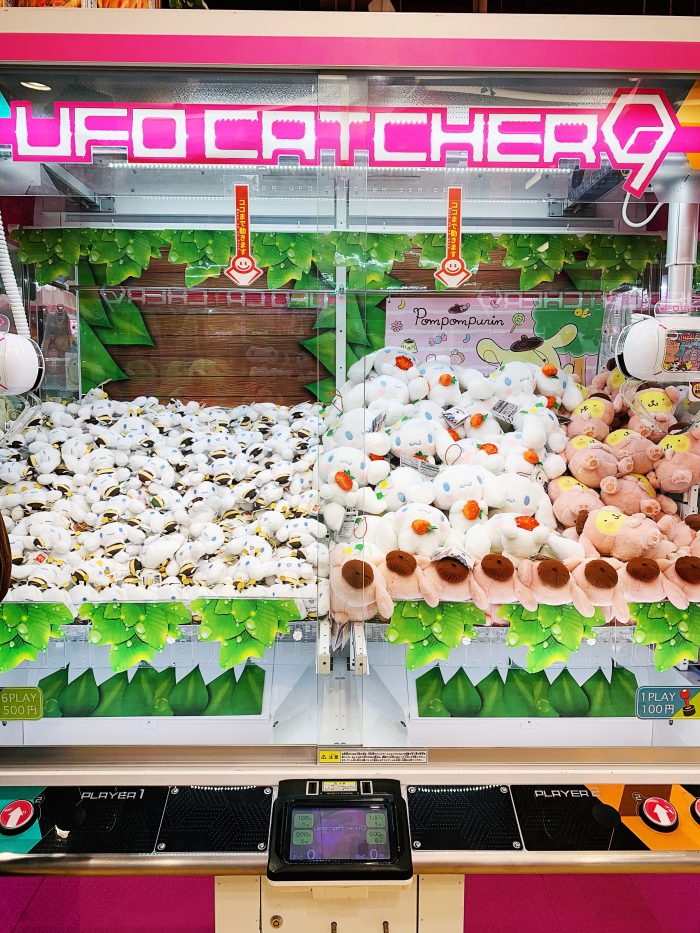
Very addictive UFO Catchers | Image by Alex Fulton Design
Torrowland at Disneyland | Image by Alex Fulton Design
Its a small world at Disneyland | Image by Alex Fulton Design
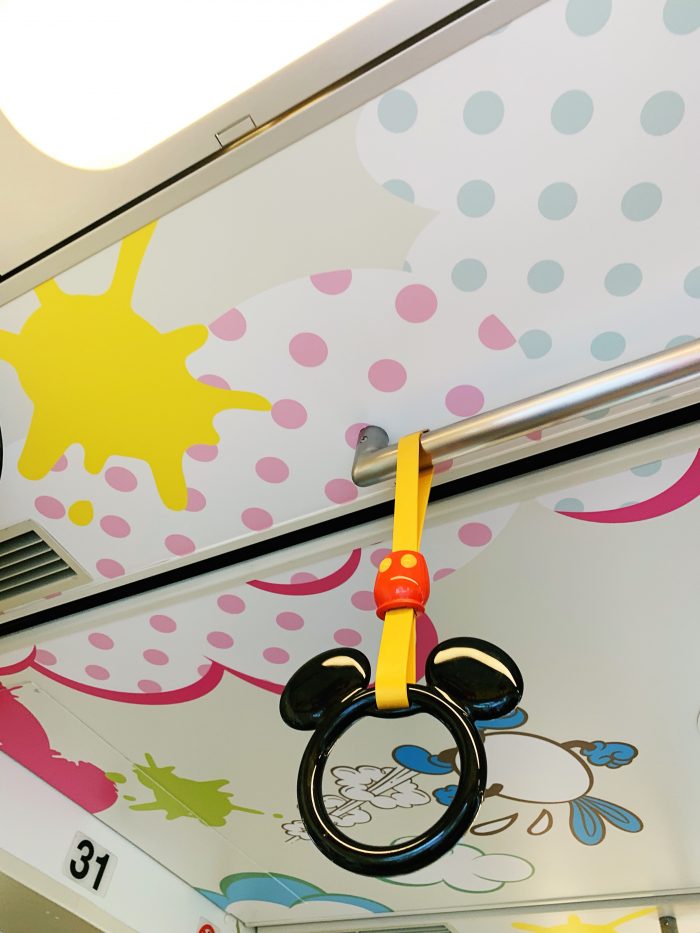
The Monorail at Disney | Image by Alex Fulton Design
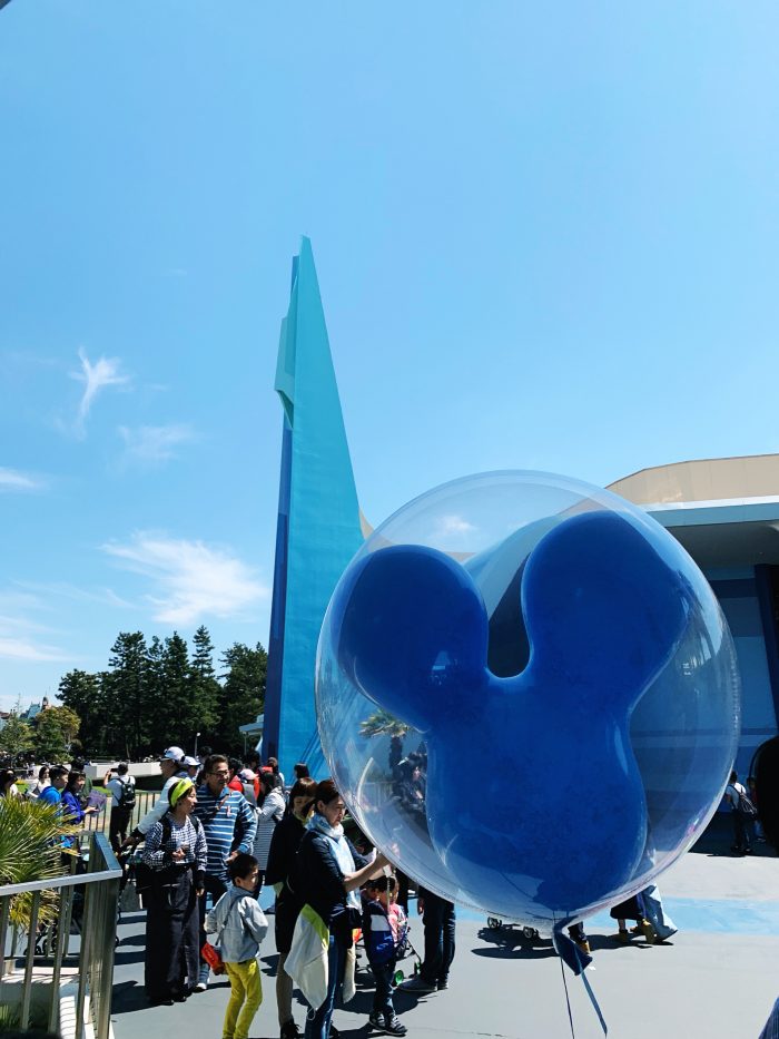
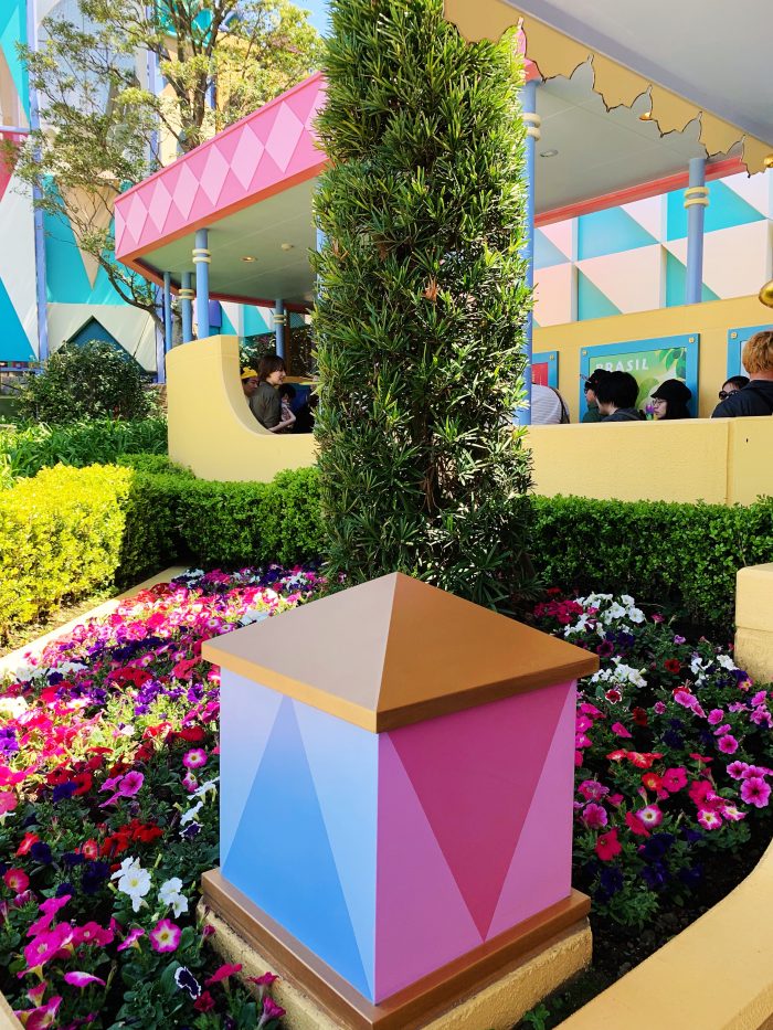
It was always on the agenda to visit Disneyland and Disney Sea and we only left 1.5 days for this, which was never going to be quite enough. We were very surprised to find that Disney Sea was very impressive and less busy than Disneyland. We enjoyed it more, but we still loved the whole Disney experience. We stayed at The Sheraton Grande which was way cheaper than the Disney Hotel and just a stop (on the Disney Monorail) away from both parks, very easy!
Disney Sea | Image by Alex Fulton Design
To Buy:
+ Pool Clothing (Collaborated with MUJI on a capsule range)
+ Camper Shoes (In any country is a joy, the one in Omote-Sando was beautiful)
+ Dover Street Market (In Ginza)
+ Tokyo Midtown (for higher end design and fashion – IDEE Design Store was my fav!)
+ 21 21 Design Site Gallery Store
+ Cat Street (for high fashion and amazing store fitouts)
+ Lush Store (In Harajuku – they have sushi train bath bombs)
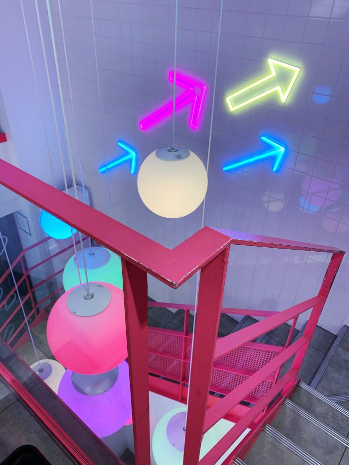
+ Opening Ceremony – (In Omote-Sando, the stairwell is a colour and pattern mind blow)
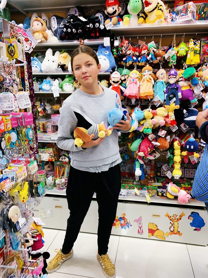
+ Mandarake (In Shibuya – descend 8 floors to Manga Heaven and head to the back of the shop for the ultimate insty shot)
+ Tokyu Hands (In Shibuya – Floors and Floors of everything)
+ LOFT Stationary store
+ MUJI (all over Tokyo but they recently opened a new flagship store)
+ Fog Linen (HQ in Setagaya City – the best linens in the land)
+ Douguya Nobori (Beautiful Japanese design store)
+ Kitchen Street in Kappabashi (Seeing is believing – there’s so much for your eyeballs here – look for the 3 teacups!)
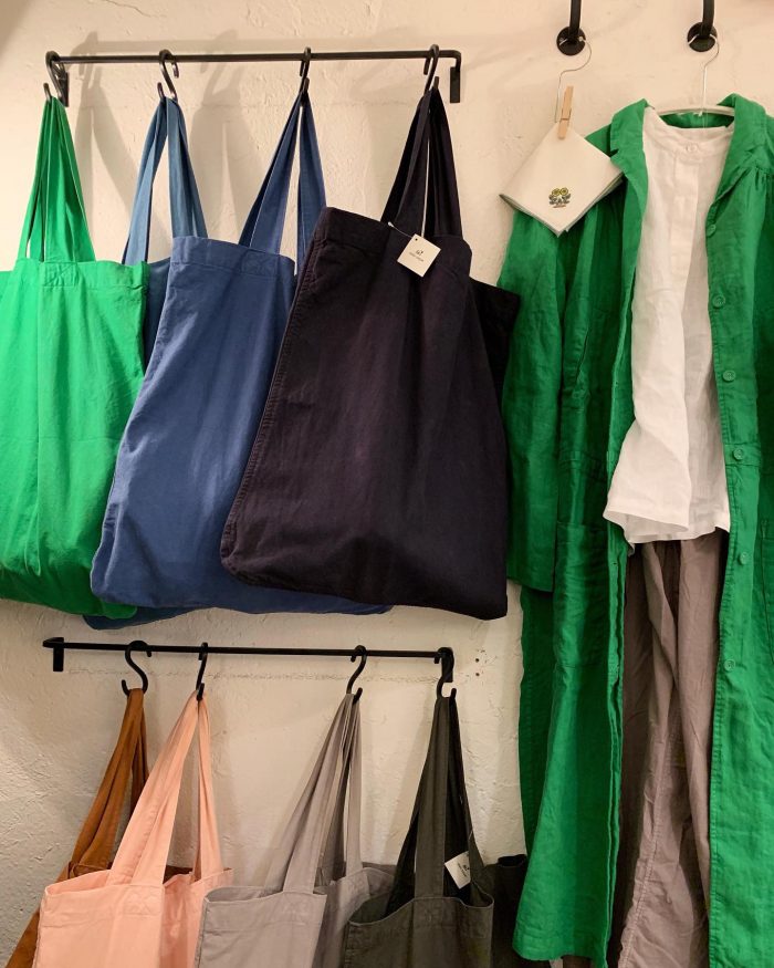
Beautiful cotton collection from Pool in collaboration with MUJI | Image by Alex Fulton Design
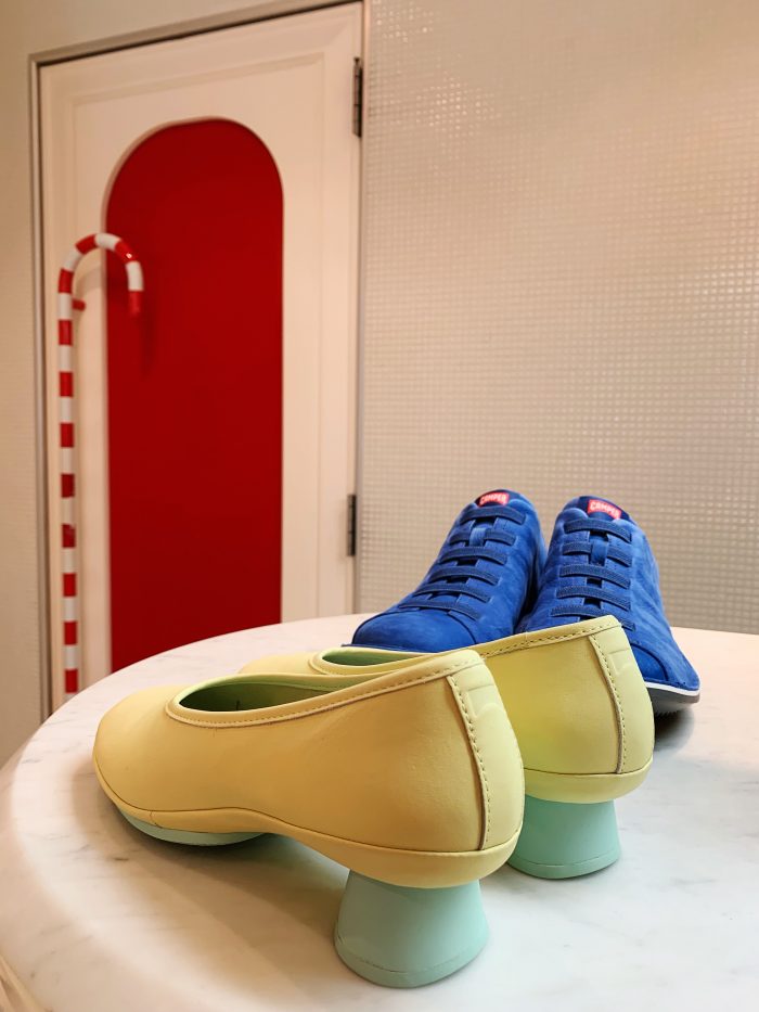
Camper buys | Image by Alex Fulton Design
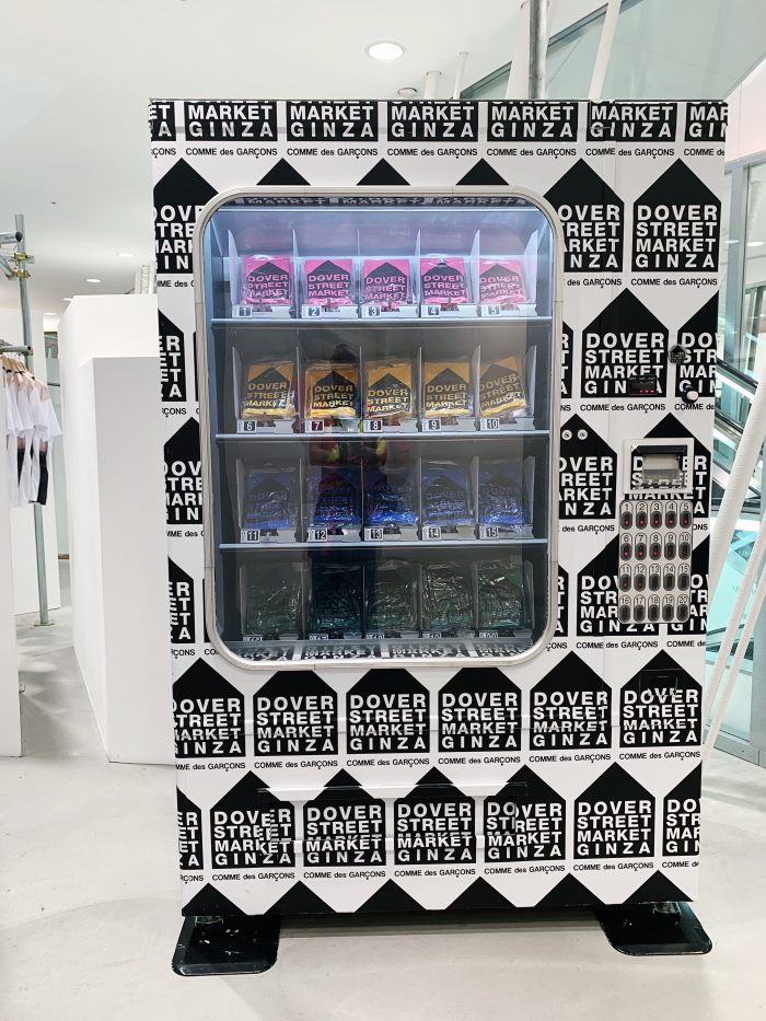
Dover Street Market in Ginza | Image by Alex Fulton Design
Dover Street Market in Ginza | Image by Alex Fulton Design
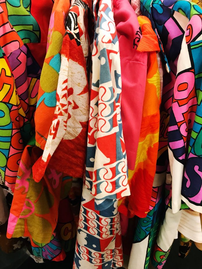
Fair to say that the shopping was nothing short of incredible – from cheaper finds in Harajuku to High End madness in Ginza, Tokyo has every you need and things you didn’t! Take a spare suitcase, as you will easily fill it with keepsakes, gifts and homewares galore. Kitchen Street alone could have taken up a whole bag with ceramics, knifes and any other kitchen utensils you can dream of!
My personal favourite was Tokyu Hands, with floors and floors of everything from dogs glasses to folding gumboots (yes I brought the later not the former) – it has a floor for everything! Start at the top and work your down and pay at the bottom and make sure you get your tax back – bonus!
Everywhere you turn in Tokyo there are things to delight your eyeballs and fill you bags. I made sure I took a generous carry bag to drag around my daily finds.
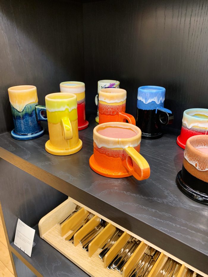
Beautiful ceramics at Tokyo Midtown Shopping Mall | Image by Alex Fulton Design
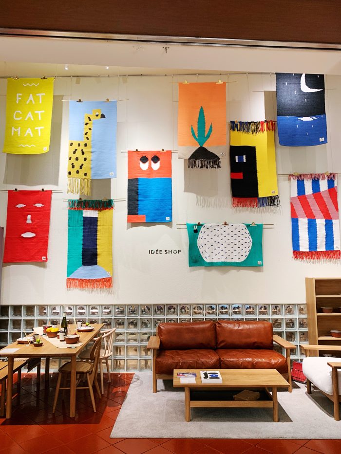
Pop up Rug Exhibition – IDEE SHOP | Image by Alex Fulton Design
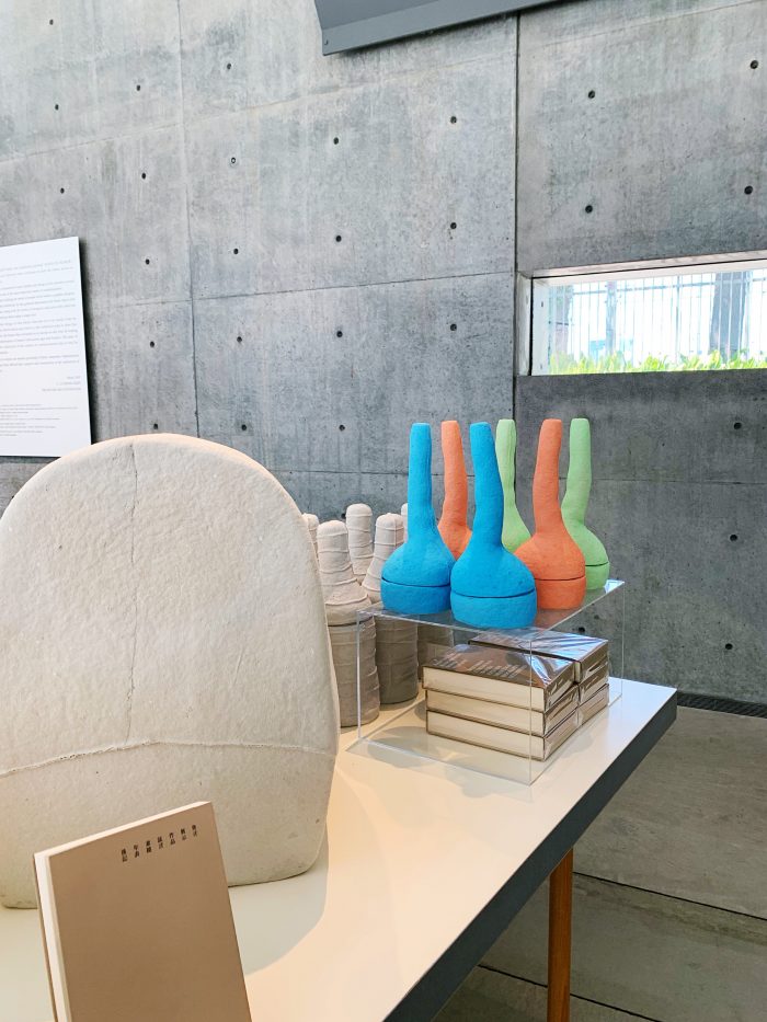
Gallery store at 21 21 Design | Image by Alex Fulton Design
Colour explosion | Image by Alex Fulton Design
Shopping heaven | Image by Alex Fulton Design
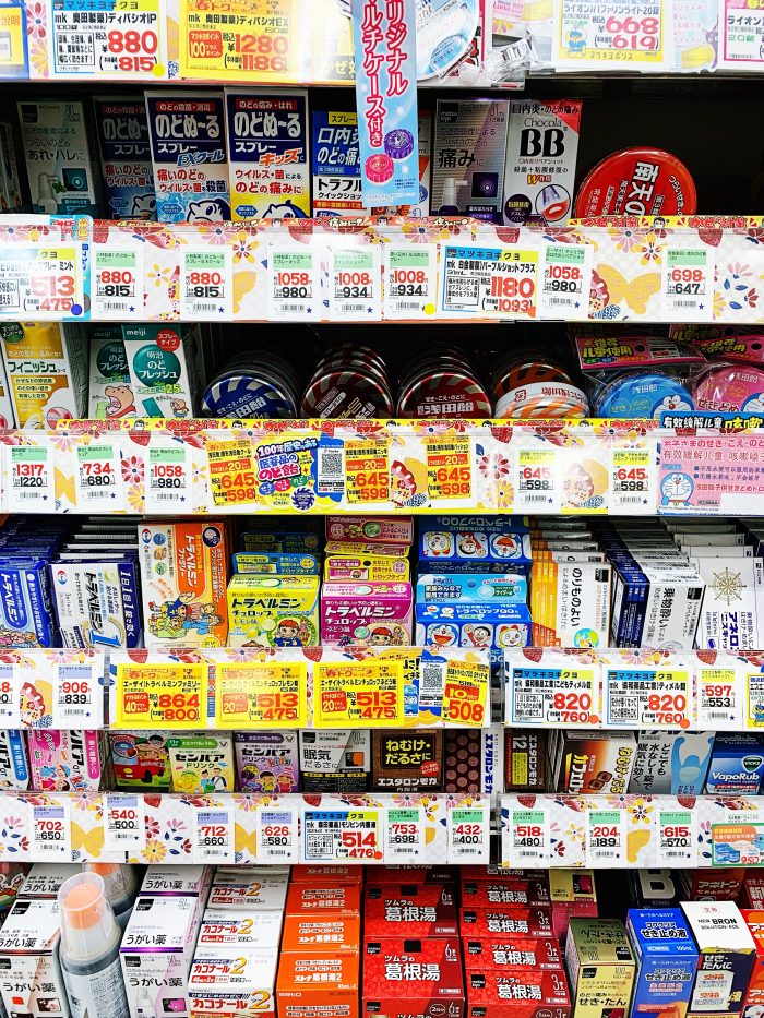
Local pharmacy goods | Image by Alex Fulton Design
Shopping in Cat Street | Image by Alex Fulton Design
Amazing shop fitouts in Harajuku | Image by Alex Fulton Design
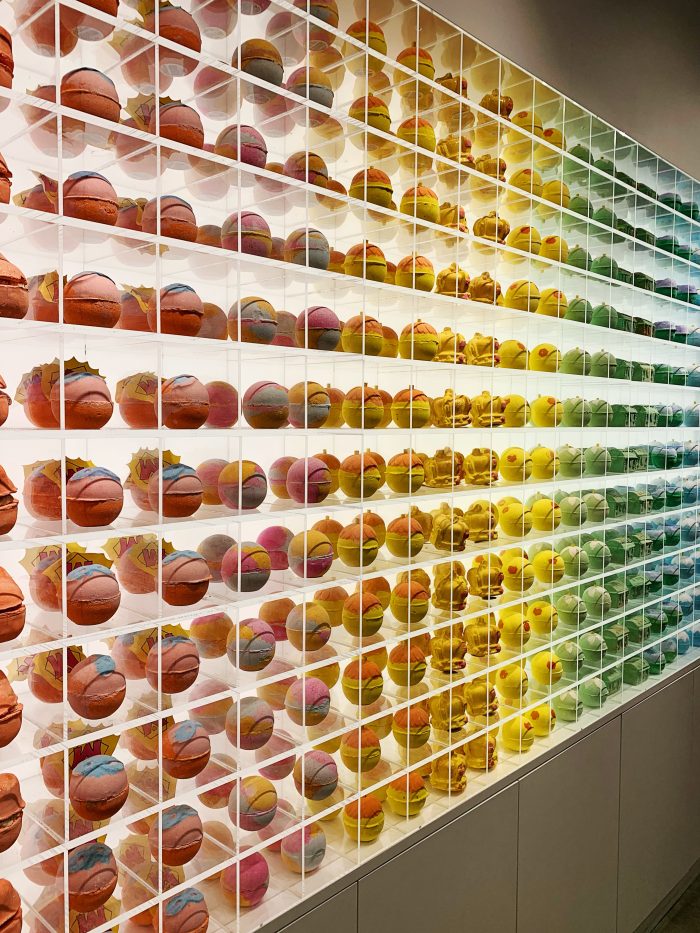
Lush in Harajuku | Image by Alex Fulton Design
Ginza department store | Image by Alex Fulton Design
Cruising the streets of Ginza | Image by Alex Fulton Design
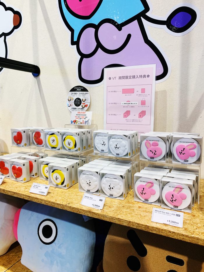
Crazy Cosmetics in Harajuku | Image by Alex Fulton Design
New Camper Shoes at Camper in Omote-Sando | Image by Alex Fulton Design
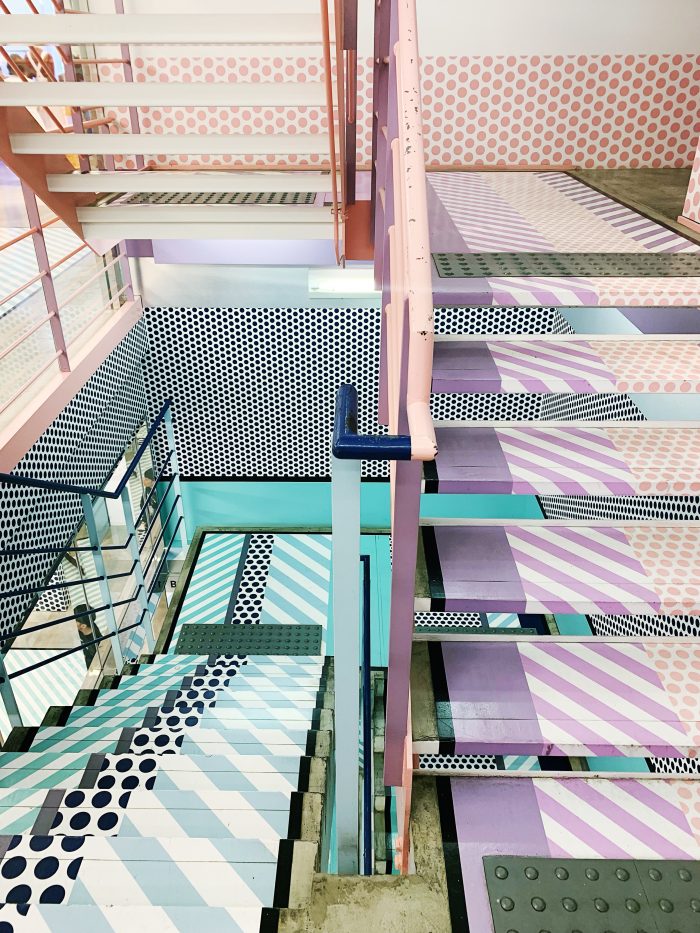
Opening Ceremony Store with its stunning colour and pattern overload was a must see
Tokyo definitely has it all and i’m glad we spent so much time exploring the city – so many people told us to do day trips outside the city, but we really wanted to get a good grip on the city itself and we certainly did. The people, the sights, the technology, the food, the shopping – it’s a true doable destination that will leave you inspired, surprised and wanting to book a ticket back as soon as your credit card has been paid off!
+ This wasn’t in anyway sponsored, I just wanted to share my experiences and all I found.
+ If you wanted to go explore Tokyo with a like minded group, I would highly suggest one of Megan Morton‘s trip through The School. She is magical and you will see and learn things that regular travel will never get.
Want all this good stuff in a nutshell? Or as they call it in the grown-up-land, a downloadable version. Get it HERE