Hold onto your hats everybody. There is a 2014 Dulux colour forecast here that will get your weatherboards rattling and your walls a-shaking. I was lucky enough to help launch these four FUTURE TRIBES at the end of last year to the Architects and Designers and now it’s out there for the rest of us to go nuts with.
(PS: and can I just say, check out my new home on the internets – cool eh. Also a HUGE HELLO to those of you that have joined me from Studio Home – you are all very welcome…)
The Digital Nomads
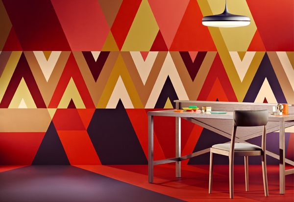
Colour and Graphics are king in the Digital Nomads palette. There is a heavy influence of tribal patterns, repetition and strong shapes, which is concurrent with a lot of branding and interior products I have seen lately.
You only have to do a visual sweep around the Pinterest boards to see how popular graphics and shapes are.
I have also seen it in wallpapers and fabrics, which again reflects how popular it is.
These strong visuals are not just for one element either – mixing patterns on patterns is certainly happening out there in interiors too.
These colours are strong and saturated but have also nodded to nature – however, with more of the stronger natural colours. They are then complimented by using a softer mate for example Dulux Double Cove (softer red pink) used alongside the bright Dulux Red Clown (intense red)
I would be inspired to use these colours to make my own patterns and shapes for interiors – lately I have been playing around with half walls – like a modern take on the old dado rail and even using a diagonal line to break up a wall and give an excuse to play around with more colours. To be even more creative you could play with geometric shapes to make your own ‘wallpaper’ with paint.
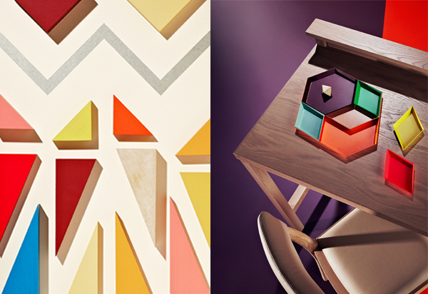
The Retro Visionaries
The Retro Visionaries colour palette most certainly has got it’s clues from the primary colour range but added side colours that help to put a unique spin on the standard blue, red and yellow.
Adding white and metallic’s will also add another element that will help highlight these strong colours.
The force is still strong with block colour, which makes me very happy, and it shows that it’s not leaving us any time soon – thank goodness!
This range inspires me to carry on with colour blocking but to look at different applications. For example I am keen to add more colour on the edge of a door or changing a white skirting.
Maybe painting a wooden floor and not just in a black or white – who’s been to see the Deadly Ponies flagship store? It’s been painted in Dulux Twilight Zone (mixture of royal blue with a hint of purple) and it’s stunning.
You can also use these colours to mix and match accessories such as furnishing, ornaments and finishing touches.
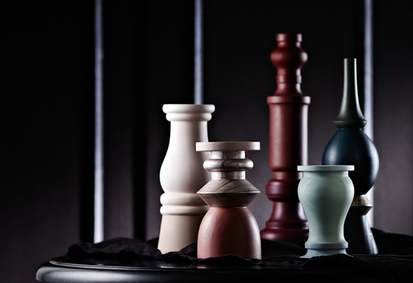
The Precious Elementals
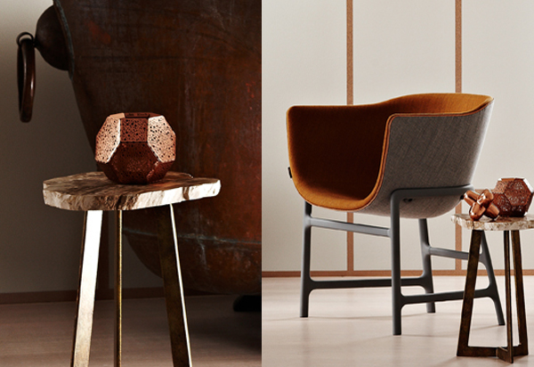
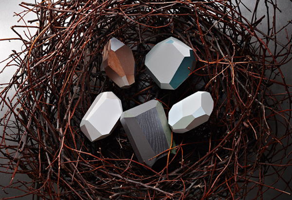
The Precious Elementals palette definitely reflects a cooler palette, but adds a touch of luxe through the use of metal elements such as copper, silver, brass and steel.
This has been offset with a more earthy side of wood, clay, leather and marble – very classic and very stylish. It’s a heady mix of easy and sophisticated living – it has depth and balance.
This inspires me to look at balancing out these two sides – luxe and earthy.
This can be done with newer types of paints such as metallic finishes but also with products.
Lighting, ornaments and furniture are heavily influenced by this combo and we have seen designers such as Tom Dixon, Phil Cuttance, Douglas and Bec, Moooi and even high street brands, such as Country Road be inspired by this trend.
The Romantic Spirits
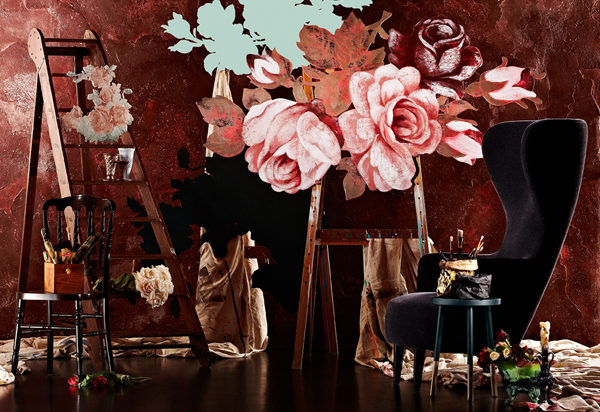
The Romantic Spirits colour palette is most definitely from a romantic era and when I first saw it, the colours take me straight back to the world of the Dutch impressionists – those moody dark backgrounds of ‘nearly there’ black but with hints of blue, red and green which perfectly offsets the soft pastels of pink and blue.
Past Dutch artists always tried to capture true life – over ripe fruit and past-their-best flowers in their still life. This is the vibe I get from this palette.
These colours inspire me to bring back the darker hues for walls – making spaces more intimate and moody. To add texture with different fabrics and furnishing and make a space that references the past but that also acknowledges the way we live today.
And as he does so well, I’ll leave the final word with my ol’ design pal Kev McCloud (from Grand Designs)
“A powerful palette to my mind is one that is not just a set of interesting colours: it’s something that has it’s own identity above those colours and which can trigger strong associations, sometimes in our subconscious, of a time or place or emotion. A single colour can of course trigger such an association by itself, like a Miles Davies solo can. The palette, on the other hand, can work like a full orchestra”.
Or watch it all un-fold here:
Photography by Mike Baker
All images thanks to DULUX
Digital Nomads has it for me! Although I do like some of the luxe in Precious Elementals.
I hear you Kara – there is bits and pieces from all!! (some more than others…)