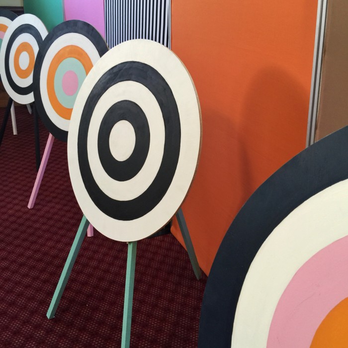
For the second year running I have been involved in the design ‘theme’ and set-up for the Marlborough Book Festival / it’s a pretty open brief and always fun working with super arty Kata Vavasour and crafty-mumma Mands Jones. These two just make it happen.
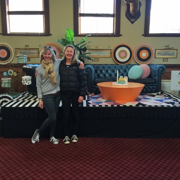
Each year we have to turn the character rich ye olde halls of The Blenheim Club into a venue suitable for 9 of New Zealand’s contemprary writers and 1 documentary maker.
This year we went with the theme of ‘targeted reading’ using a delicious combination of Dulux* colours:
Okarito (White)
Taihape (Black)
Dashwood Pass (Caramel)
Mavora (Mid Gray)
Cook Strait (Ocean Blue)
D’urville Island (Seafoam Green)
Morison Bush (Light Green)
Moorhouse St (Orange)
* special thanks to Dulux as all the paint was donated free of charge
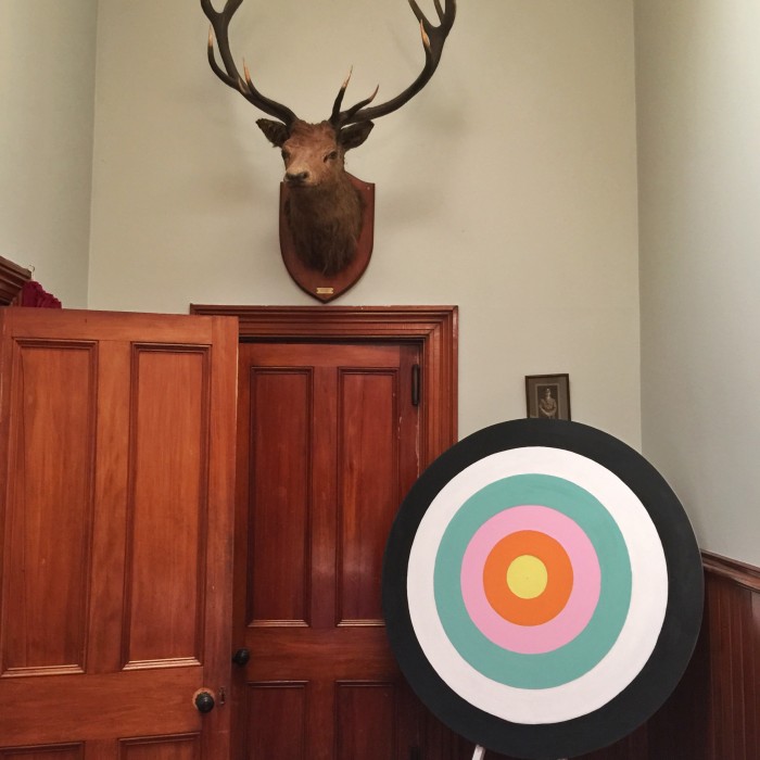
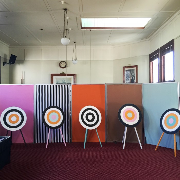
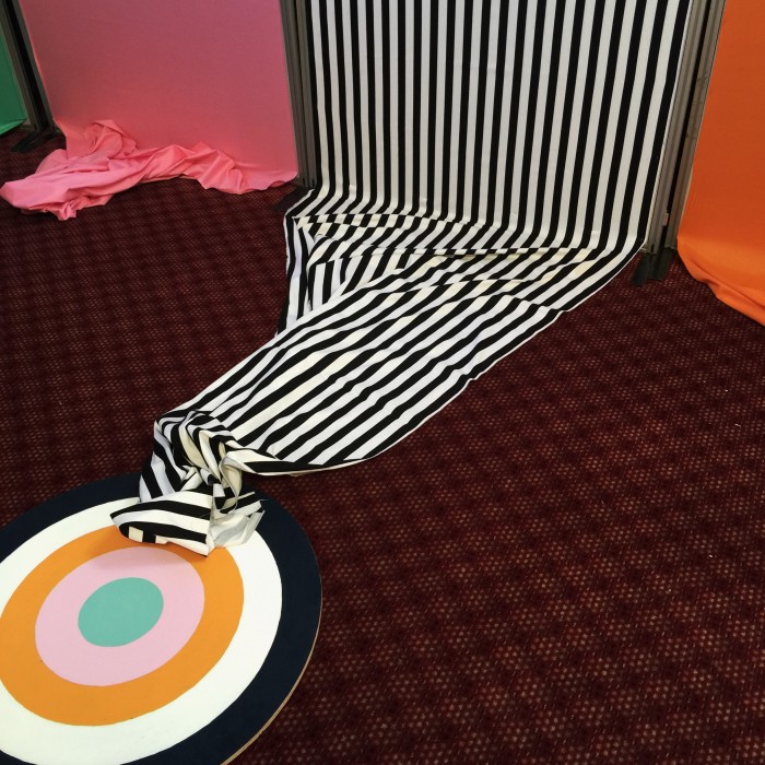
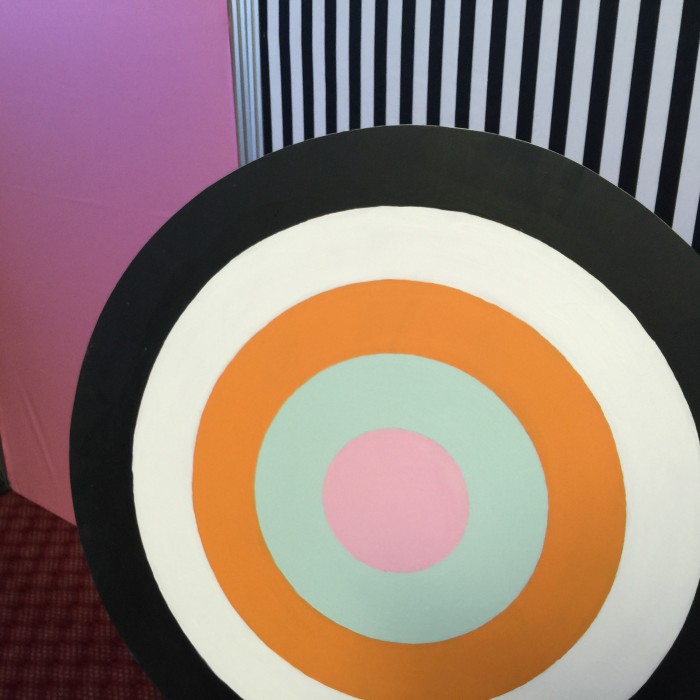
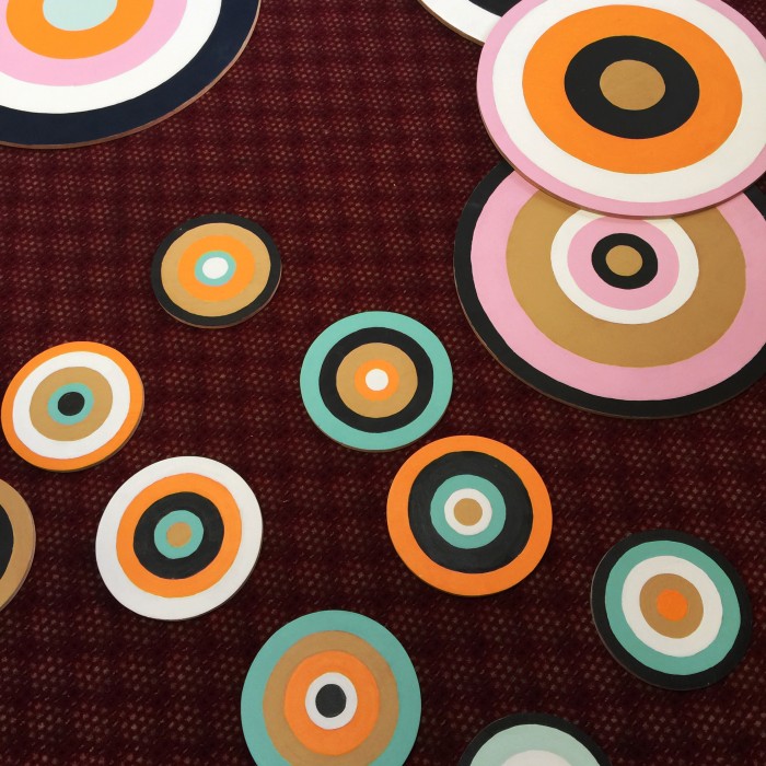
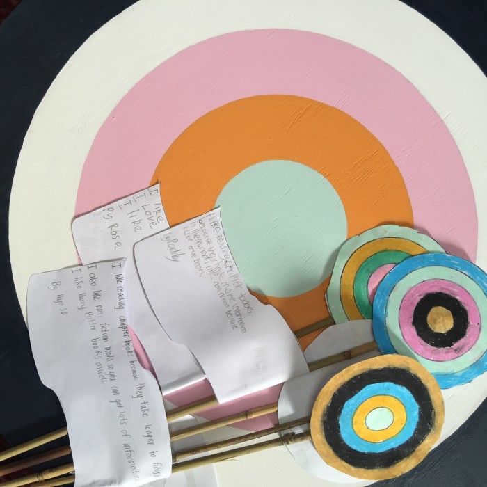
Kate asked her wee students to ask what reading means to them… super cute.
The stage used products from the AFD Store – tying in the colours that were used in the targets.
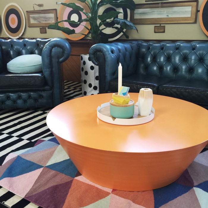
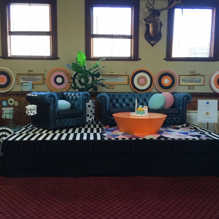
Photography: Alex Fulton via iPhone 6 Plus
Comments are closed.