BLOG

2014 Dulux Colour Awards

Dulux1

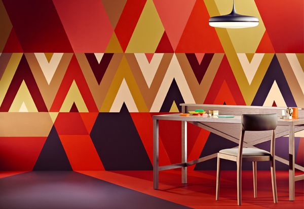
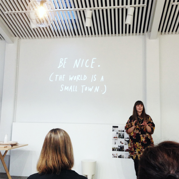
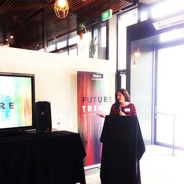
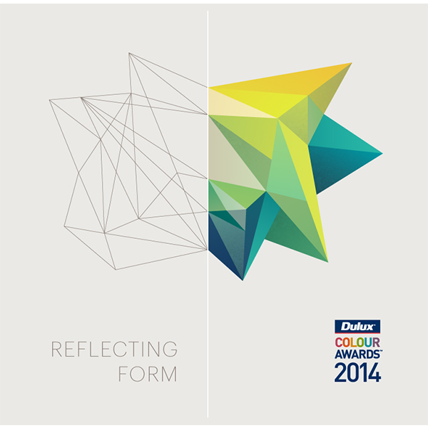
Well it’s rolled around again, the 2014 Dulux Colour Awards.  An Australasian colour comp that showcases the best of the best in colour design.

There are seventy six finalists this year, selected from 197 enteries from Australia and New Zealand.

All in all there are nine catagories with the Commerical Interior category again being the most represented and with the most finalists, 20.  Single Residential Interior followed closely with 12 and Commercial Exterior with 11 finalists.  There are a total of eight shortlisted projects in both the Commercial Interior Refurbishment and Student categories; five with Single Residential Exterior; and four in the Multi Residential Exterior, Residential Interior Refurbishment and Multi Residential Interior categories.

The good (and very exciting news) is that there are 6 finalists from New Zealand.  Quite an achievement and an even bigger one if a kiwi can take out a win!  Brace for it, but two of those spots are actually two of my very own projects that I have been working on over the past year.

Dulux Finalists 06 Dulux Finalists 03 Dulux Finalists 02

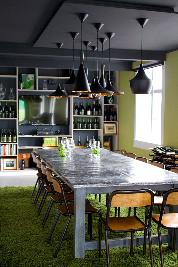
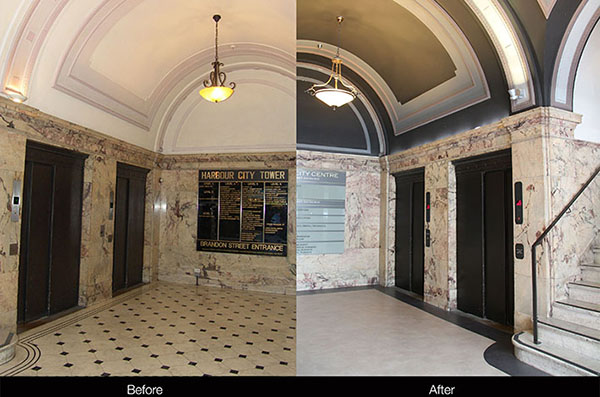
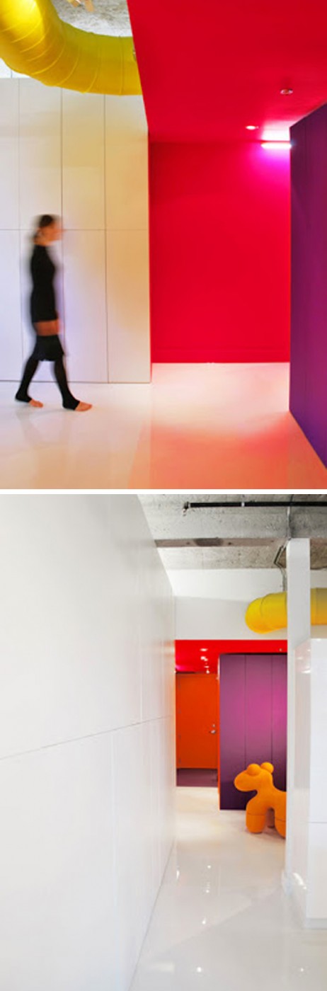
My Astrolabe Wines Office/Winetasting fit out  project is in the heavy populated Commerical Category and I also share with two other NZ designers, Studio Pacfic Architecture (Habour City Centre) and Outline Design (8 Leek St project).  Three out of twenty make for some good odds!

Alex Fulton

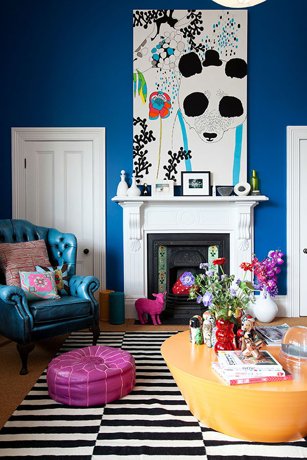
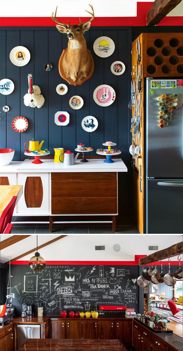
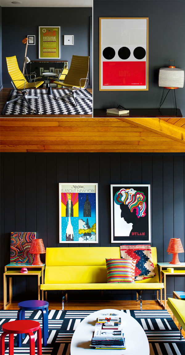
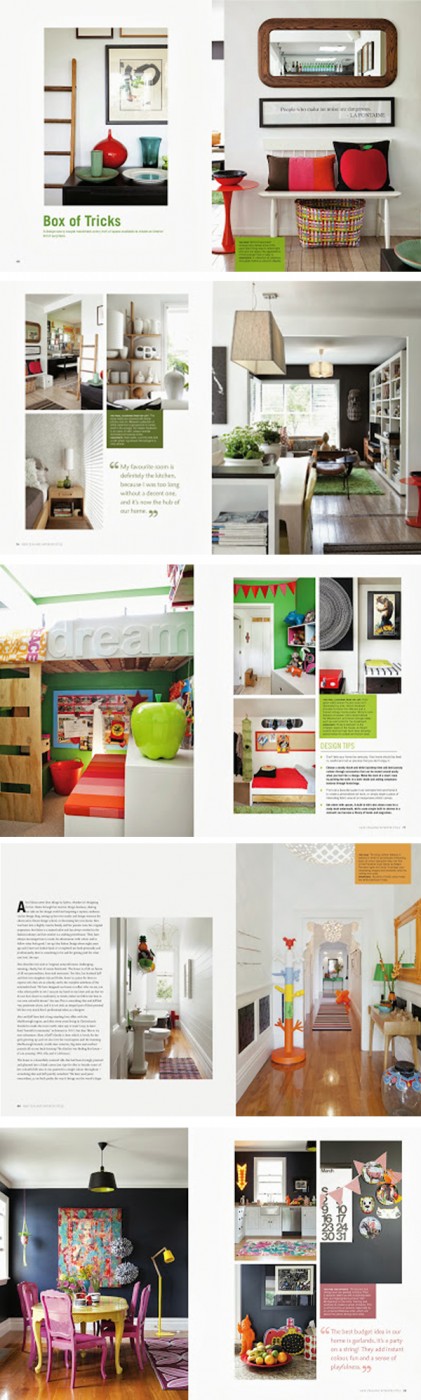
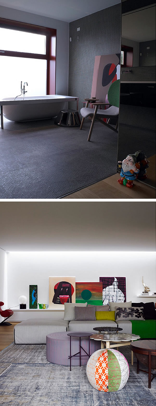
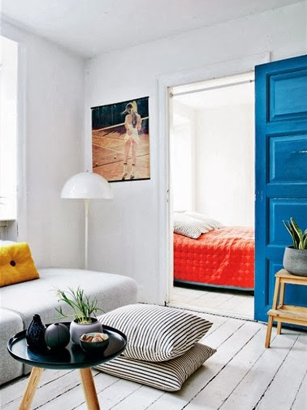
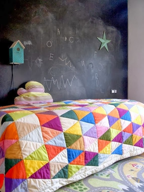
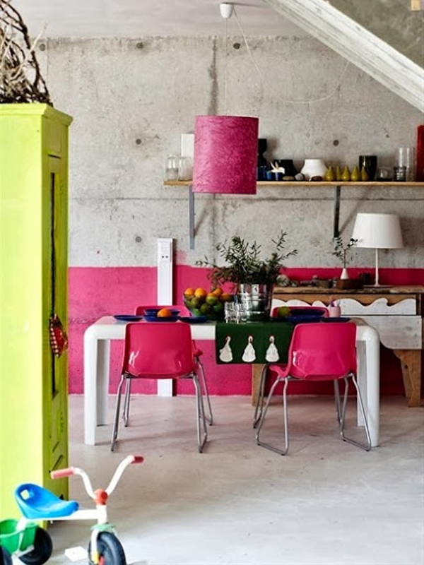
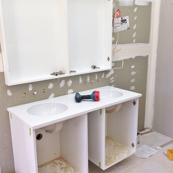
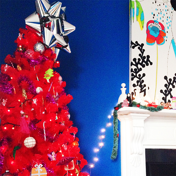
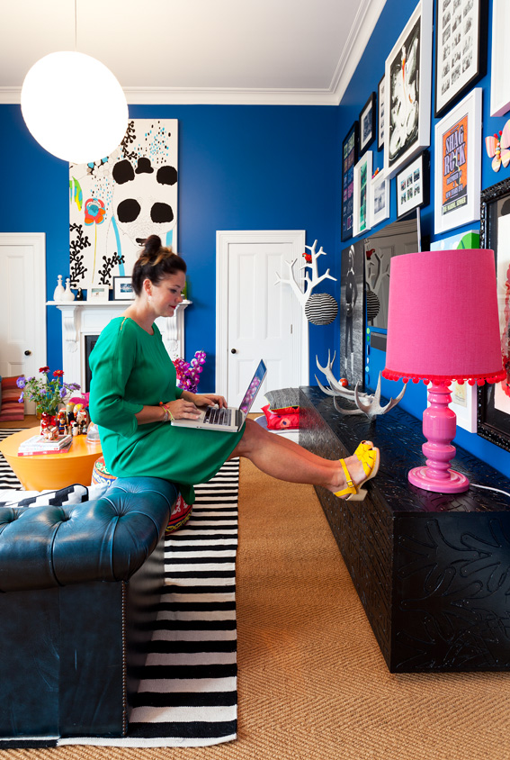
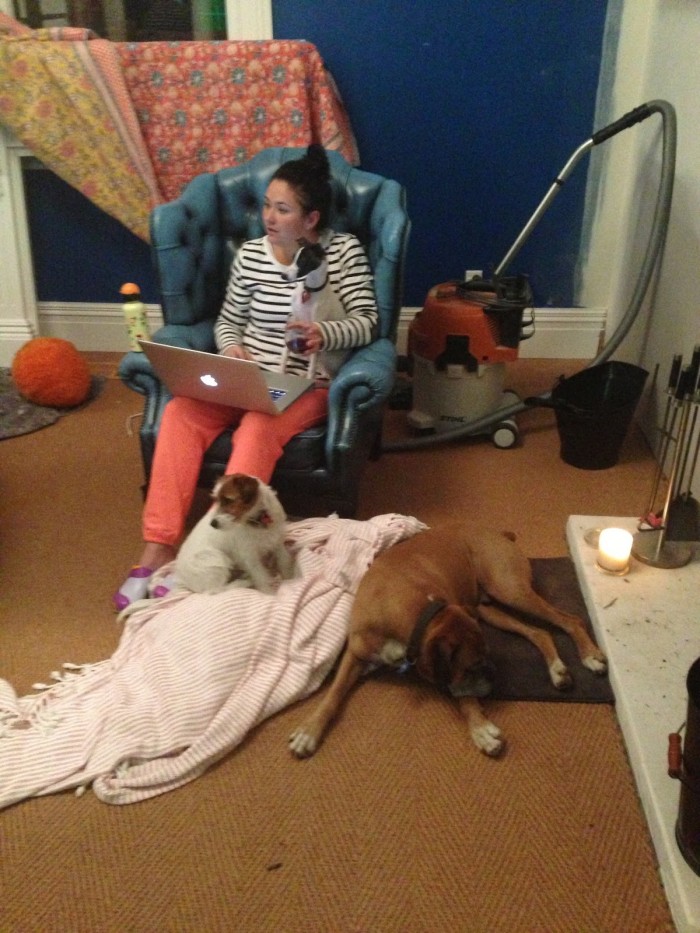
I’m alone with eleven Aussies in the Residential Interiors catagory with my Murphys Road House project.  You may or may not have realised that this is actually my our house.  Probably the trickiest client you have – yourself!  Anyway, my bold colours and classic villa mash-up seems to have hit the right note for the prelim judges.  Yay.

Dulux Finalists 04 Dulux Finalists 01

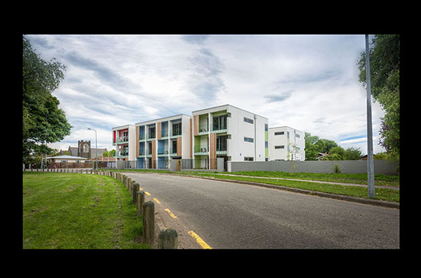
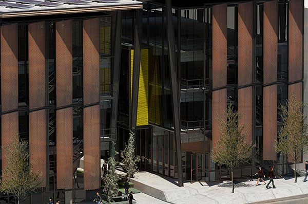
The Multi-residential Exterior category features Stufken + Chambers Architects (Riccarton Road Apartments) and in the  Student Catagory Henry D’Ath (283 Cuba Street) is a finalist.  Exciting plus.

This year I wasn’t sure if I could enter (becasue my colour ambassador role with Dulux) but after checking it turns out I could becasue it’s all judged blind.  I decided to enter two and so when I was notified that both were in the finals it truely was a happy dance moment.  It can be a lonely ol’ world working for yourself and deisgning solo, so this really is buzzy when your industry recognises you.  Hello.

I’ll be taking the chance to attend the finals, pat the Dulux dog and go hang with a bunch of clever Australians.  I might also get in a spot of ‘shopping for the shop’ whilist in Melbourne.  Will show and tell all then…

1 comment

Feed for thought

FFT-1-Feb-14

Brit + Co

I see some good stuff.  I call it research AND to ligitimise it even more I have created a new regular post called ‘Feed for thought’.

FFT2

SF Girl by Bay (featuring Country Road new Homewares)

It self explanatory but basically I will share you my favourite images (who ever reads the words anyways) from my blog feed.

FFT3

Sydney based Artist Michael Muir.  Photo by Carine Thevenau for The Design Files

I find it’s such a great way to recharge the creative batts and limber up my designery muscles.

FFT4

Charlotte Love Blog featuring images from GoodHomes Magazine, photos by Andrew M. Boyd

Enjoy the view and feast away…

No comments

Dulux: 2014 Colour Forecast

Hold onto your hats everybody. There is a 2014 Dulux colour forecast here that will get your weatherboards rattling and your walls a-shaking. I was lucky enough to help launch these four FUTURE TRIBES at the end of last year to the Architects and Designers and now it’s out there for the rest of us to go nuts with.

(PS: and can I just say, check out my new home on the internets – cool eh.  Also a HUGE HELLO to those of you that have joined me from Studio Home – you are all very welcome…)

The Digital Nomads

02 - Dulux Colour Forcast 01 - Dulux Colour Forcast

Colour and Graphics are king in the Digital Nomads palette.  There is a heavy influence of tribal patterns, repetition and strong shapes, which is concurrent with a lot of branding and interior products I have seen lately.

You only have to do a visual sweep around the Pinterest boards to see how popular graphics and shapes are.

I have also seen it in wallpapers and fabrics, which again reflects how popular it is.

These strong visuals are not just for one element either – mixing patterns on patterns is certainly happening out there in interiors too.

These colours are strong and saturated but have also nodded to nature – however, with more of the stronger natural colours.  They are then complimented by using a softer mate for example Dulux Double Cove (softer red pink) used alongside the bright Dulux Red Clown (intense red)

I would be inspired to use these colours to make my own patterns and shapes for interiors – lately I have been playing around with half walls – like a modern take on the old dado rail and even using a diagonal line to break up a wall and give an excuse to play around with more colours.  To be even more creative you could play with geometric shapes to make your own ‘wallpaper’ with paint.

The Retro Visionaries

10 - Dulux Colour Forcast 08 - Dulux Colour Forcast

The Retro Visionaries colour palette most certainly has got it’s clues from the primary colour range but added side colours that help to put a unique spin on the standard blue, red and yellow.

Adding white and metallic’s will also add another element that will help highlight these strong colours.

The force is still strong with block colour, which makes me very happy, and it shows that it’s not leaving us any time soon – thank goodness!

This range inspires me to carry on with colour blocking but to look at different applications.  For example I am keen to add more colour on the edge of a door or changing a white skirting.

Maybe painting a wooden floor and not just in a black or white – who’s been to see the Deadly Ponies flagship store?  It’s been painted in Dulux Twilight Zone (mixture of royal blue with a hint of purple) and it’s stunning.

You can also use these colours to mix and match accessories such as furnishing, ornaments and finishing touches.

The Precious Elementals

05 - Dulux Colour Forcast 04 - Dulux Colour Forcast

The Precious Elementals palette definitely reflects a cooler palette, but adds a touch of luxe through the use of metal elements such as copper, silver, brass and steel.

This has been offset with a more earthy side of wood, clay, leather and marble – very classic and very stylish.  It’s a heady mix of easy and sophisticated living – it has depth and balance.

This inspires me to look at balancing out these two sides – luxe and earthy.

This can be done with newer types of paints such as metallic finishes but also with products.

Lighting, ornaments and furniture are heavily influenced by this combo and we have seen designers such as Tom Dixon, Phil Cuttance, Douglas and Bec, Moooi and even high street brands, such as Country Road be inspired by this trend.

The Romantic Spirits

15 - Dulux Colour Forcast 12 - Dulux Colour Forcast

The Romantic Spirits colour palette is most definitely from a romantic era and when I first saw it, the colours take me straight back to the world of the Dutch impressionists – those moody dark backgrounds of ‘nearly there’ black but with hints of blue, red and green which perfectly offsets the soft pastels of pink and blue.

Past Dutch artists always tried to capture true life – over ripe fruit and past-their-best flowers in their still life. This is the vibe I get from this palette.

These colours inspire me to bring back the darker hues for walls – making spaces more intimate and moody.  To add texture with different fabrics and furnishing and make a space that references the past but that also acknowledges the way we live today.

And as he does so well, I’ll leave the final word with my ol’ design pal Kev McCloud (from Grand Designs)

“A powerful palette to my mind is one that is not just a set of interesting colours: it’s something that has it’s own identity above those colours and which can trigger strong associations, sometimes in our subconscious, of a time or place or emotion.  A single colour can of course trigger such an association by itself, like a Miles Davies solo can.  The palette, on the other hand, can work like a full orchestra”.

Or watch it all un-fold here:

Photography by Mike Baker

All images thanks to DULUX

2 comments

It’s not about faces, just places, spaces: Weekend home of Bradford Shellhammer

  Bradford-Home-02

Not usually a fan of b.board but in this context it’s good.  Relaxed and cheeky – just like the rest of the house.

It’s been a weeny while since the last ‘It’s not about faces…’ segment and it’s come back into town like a band of colourful gypsies firing off confetti guns.

This home is a goodie.  It’s all that is good in the world and it’s just for the weekends.

Probably the best stop-in-your-tracks image I have seen in a while.  Get that red trim looking all cute as you like next to that nasty matte black.  Pop on top bright plates and a turkey head and BAM.  Magic.  There’s no kitchen unit – just an upcycled of a retro piece.  Well played Mr Shellhammer.  Spot blinkin’ on.

Ahhhh – more black matte maddness which could not be a better backdrop for the primary colour showcase.  And showcase it does.  I love you.

Carpet tiles replace a conventional rug in a mixture of black/white/and multi.

High fives for keeping the wood too.

The owner, Bradford Shellhammer is the Fab.com creator and his home really represents what his company is all about – fun, whimsey and colour.  I love what he has to say about decorating your home…

  Bradford-Home-01

“At Fab, we’re on a mission to rid the world of boring beiges—not get rid of beige altogether, per se, but to give people permission to explore and bring life and fun into the world they live in.”

Heck yeeeeahhh.

Thanks to Jonathan Lo from Happy Mundane for posting this home and Lee Tran Lam of Inside/Out for featuring this gorge-beast-of-a-home.

All images by Trevor Tondro.


No comments

Attending: New Zealand Interior Style Book Launch, The Bloc, Auckland

Interior-Style-Book

If you are connected to any sort of interior design blog or social media you will have noticed that there is a new book in town.

It’s not just any book.  It’s a uniquely New Zealand Interior design based coffee table book that is superbly photographed by Larnie Nicolson and handsomly written by LeeAnn Yare.

Attending-06-1

This dynamic duo have been writting and snapping interiors for years and are on high rotate in most of the NZ shelters mag so it’s no surprise that they have extended this successful formula into the book world.

Attending-01---Full-Article

They have handpicked 24 homes that are based all over NZ and certainly capture the creativity, design and uniquely kiwi interior flavours of this wonderful country.

I can also proudly tell you that I was luckly enough to be chosen to be one of the houses and it’s quite the wee thill to see your home in glossy big pages.  An even bigger surprise was being featured on the back of the book – the cover went to LeeAnn’s own house so I’m in good company.

Speaking of excellent company – some of my favourite homes included are by my colour design sister Anya Brighouse, the urban funked-out pad of the Federation couple Nick and Jenny Clegg, Wellington style queen and owner of Small Acorns Amanda Holland and furniture rad couple Stu and Melissa Bowman from Apartmento/Meluka.

Attending-Book--1

Showing off the back of the book – the girls surprised me on the night  with my ‘Jungle Room’ on the reverse. Oh and look at Larnie looking all hot in front of the camera

Attending-Book--03

With my gals Ses and Jen Style Files

Thanks again LeeAnn and Larnie.


No comments

It’s not about faces, just places, spaces: Patrizia Moroso’s home designed by Patricia Urquiola

 The-Pats--19
a bunch o’ Pats

Moroso got Urquiola in to design her home.
Showing off – maybe – but the who cares when you have these results.

The-Pats-02
 The-Pats-03
Rad home with touches of brilliance and design wizardry.
colour – check
design – check
badassfunkychair – check
‘Pat’ch made in heaven.
No comments

10 Tips and Tricks: Pinterest

Tips-on-Pinterest-10

Image from here

Hands up who is out there pinning up a storm.  Me.

Both mine are up.
Pinterest is such a niffy tool that I could not imagine life without it.
For those of you that don’t know, Pinterest serves as a kind of visual ‘wishlist’.
Let me break it down for you – prepare for ‘bunnyears’ abound.
To set up a Pinterest account you ask to be ‘invited’
Once setup you can create ‘boards’
Users or ‘Pinners’ can ‘pin’ images to boards that they organise under their user name
Pinners can pin straight from the interweb, from your own snaps, or from others pinners pins.
Pinny pin pin.
It’s actually really easy pease.  Just start.  You won’t stop.  I tried.
Tips-on-Pinterest-09
image from here

What MAY help you are some of my tricks and tips that I have learnt along the way to make ‘pinning’ easy and to max out it’s potiental.

1.  Start by calling it it’s proper name.  It’s Pinterest.  As in Pin-ter-est.  NOT Pininterest. PININTEREST.  PININTEREST.  Sound it out stoopid.  Just Pin-ter-est.  Touchy much?
and breathe.
Tips-on-Pinterest-08
Image from here and taken by Kirsty Gibson

2.  Good, now set up boards.  Some pinners have found snazzy ways to be cool with making boards name look tripster but I kinda missed that memo and just called things as I see them.  Some use capitals (eg: YUMMYINMYTUMMY – which is kind of shouty but hey – your board), some use symbols (eg:  //Kitchens//) some just state the obvious.  Whatever you do, make sure that you fill your boards with good images that reflect the name of the board.  It can also be highly responsible to have a good spring clean out now and then – that board you called ‘Stain removal’ and has only one pin in it with a tip of how to cat vomit may need to go (or not – your board – not mine).

Tips-on-Pinterest-07
Image from here

3. Let you boards be reflective of you.  Especially if you are linking yourself with a blog, a business or a brand then consider your boards to be an extention of that.  Think about what your readers or consummers would like to see, but utimately pin for yourself as that will tell a far intimate story.

Tips-on-Pinterest-06
Image from here

4.  You can choose to follow a fellow pinner (and all their boards) or you can choose just a few select boards from that pinner.  You may find your new pinner ‘friend’ from sweden has immpeciable taste in homewares but also a fasination with exposed body parts.  Hey, that’s cool man, but somethings can be un-follwed no worries.  Sorry Hedwig but I’m unfollowing ‘Mighty Manslem’s’.

Tips-on-Pinterest-04
Image from here

5.  Download the ‘pin it’ button onto your desktop.  That way you can pin images you see while eyeballing the web.  Now you don’t have to try and manage web pages – just store them in the pinning boards you have created.  If there is an image that’s not worthy of a board then just ‘like’ with the heart button.  Your Pinterest will remember those and you can refer back to them anytime you choose under ‘likes’.

Tips-on-Pinterest-05
Image from here

6.  Get the app and pin from your phone.  A good and easy way to load a photo ready for a good viral thrashing. You can also view your pin ‘stream’ when bored and have 5 minutes to spare on the toilet.

I would love to know those stats.
Tips-on-Pinterest-03
Image from here

7.  Link, name, and put in as much information as you can.  I always try and think of the clever photographer that took the image.  Let’s share the love and link link link.  Credit everything to the original source where poss and try and be a good, safe and thoughtful pinner.  That’s good pin-karma.

Tips-on-Pinterest-02
Image from here

8. Be interactive with your pins.  You can change the setting of a board to have other pinners be ‘contributors’.  No Hedwig, not this time.  You can also interact with fellow pinners just like in istagram and twitter just by adding the ‘@’ symbol.  Nice.

Tips-on-Pinterest-01
Image from here
9.  Finding different pins and pinners.  You don’t have to rely on the people you follow to give you inspiration – broaden your horizon by looking at your favourite pinners and who they follow.  Same applies for your pins – quite often if I find a pin I really like I will keep scrolling downwards and it will show you ‘like-minded’ pins.  It’s a rabbit hole so do try to remember to come up for some real air from time to time.  As much as we love time on the net, don’t forget the real world exsists too!
10.  Shhhhhh, secret!  Use the secret boards to design a new logo,  plan a surprise party or imagine your special day when you are not even engaged.  I also use these with clients so that we can share ideas without worrying that others may be watching.  You ony get 5 of these so use them for current stuff.
I’m sure there is more but that will keep you pinning for a while longer!
You can find me here on Pinterest under user name helloalexfulton
All the images I have shared are all from my boards – so yeah, go look and pin.
If you have a tip or trick for Pinterest please share!
That would pin-tastc (too much?  too much.)
1 comment

It’s not about faces, just places, spaces: The Colourful Loft by Jean Verville

Colourful-Loft-01

Holy shiz balls.  Now this is what I call colourtastic.

Colourful-Loft-04 Colourful-Loft-05 Colourful-Loft-02

When so many are afraid of colour, it is just utter joy when I see a home such as this.
The brief was to design a space that could house and show-off a colourful collection of contempory art.  Jean Verville is a Canadian based Architect who I’m sure delighted his clients with this original solution.
Avoiding the obvious – all white walls – he has created playful arrangement and unusual focal points using colour and form.
Colourful-Loft-06
Pure colour-blocking genius.
1 comment

Update: Yes, I know it’s well overdue!

Update-01

Well.  There’s been a world of happenings here at AFD HQ.
They are as follows:
Re-branding of AFD and new website/blog 
This is been a 6 month undertaking but I’m nearly there.
I have been ‘finding myself’ left right and centre and making myself a new look.  I have a fabulous team helping me with all this and all should be revealed  in the next few weeks.
That does mean that the blog will have a new home as well as a new look and I will be able to put into place many of the new things I learnt from my recent Blogcademy Course I attended last month.
Update---02
Blogcademy (Auckland)
Holy.  What a information-fest.  For those of you not in the know this is a blog school run by three pretty dynamic birds – Gala, Shauna and Kat from Gala DarlingNubbly Twiglet and Rock n Roll Bride respectively.  A powerhouse of blogging talent they certainly passed on oodles of info.  It was also an amazing weekend connecting with some pretty awesome bloggers from all over this country.  So the timing has been pretty good for this new branding lark and most defiantly inspirational – especially Shauna.  She was a wealth of knowledge and has got me lining up many ducks.  Watch this space (well maybe not this space as a NEW blog will be up and running in the new year).  Yip!
Update-03
Megan Morton’s The School (Auckland)
Yes, another trip, and another hot weekend of learning, meeting amazing people and generally just mixing with like minded slashies (and Australianismfor a person that does much and many – Thanks Megan for this term, is tresuseful!)  I think I won most attended course but I wanted to make the most of it all – only because I knew that it would ALL be good.  I also got to hang with my new design assistance (YES I JUST SAID THAT).  More in a sec.  I did want to say a heart felt massive yummy thank you to Megan Morton, Sophie The, KaraRosenlund, Simone Madigan, Stephanie Somebody and Brooke Holm.  Find more about them here.  They all rock the planet.  I learnt all and much.
Update-03
Update-05
Update-04
Sophie Jensen (My Design Assistant)
I know right!  This is very exciting and a little scary if I’m honest.  Oh the responsibilty – not just myself to think of!  Sophie came to me back in June this year as an Intern – she emailed and asked to come and work for me for free.  She drove all the way down here to Blenheim and found accommodation all off her own initiative.  She was a wee ray of sunshine to have in my world and I was very lucky to share that week with her.  NOW she’s back as my employee and I have big plans for this little lady.  I’m hoping to bring you a bigger and brighter world of me with Sophie’s help.  She is super enthusiastic, colourful and smilie, oh and did I mention talented, crafty and designery?!  She will fit in oh so well!
Update-06
Dulux Ambassador
Yes it’s true!  Starting with my wee stint as a guest judge on the Block NZ this year, Dulux contacted me and asked if I would consider a role as their interior design ambassador.  Ahhhh OK!  Dream role!  Colour, colour and more colour!  My first official role was to help launch the 2014 Dulux forecast which I will post in detail (to follow).  What an honour!  I got to speak to designers and specifiers all over NZ and talk about the new colours that are coming through in interiors.  It really was fun to be apart of.  Next year things will continue and there is going to be some amazing collaborations.
Update-07
Home Rennovations
Yes as well as working with many inspiring projects this year I am undertaking my own interior change.  Currently we are re-doing a very old and tired ensuite and making it a bathroom that joins our two daughter’s rooms.  I’ve already sneaked/peaked you into a little of what’s happening via my instagram feed (here) #afdgirlsbathroom.  It’s very excited but has started some huge ‘builders creep’. BUSY!
Update-08
Update-12
General stuff
Because of my new Sophie coming I got very excited – even to the point of considering moving to a real live retail space.  This was ambitious on my part, I think I just got a bit excited my the thought of having an extra set of hands BUT what it did do was to help me work out what I need to do next.  A retail space is a great idea and maybe for the future but right now I got some other i’s to dot.  All in good time.  You will notice (soon) that there is an AFD store link on my new site and that will be coming in 2014.  Baby steps but still exceptionally exciting.  So I’ve been organising and re-jigging my current studio space to make room for Sophie and to be able to accommodate more crafting, DIYing, creating and stock.  Hooray!
Update-13
Update-11
The last thing
I really wanted to wish you all a very merry Christmas and happy new year.  Instead of stressing myself silly about posting over the holidays – I’m just going to not.  I do have one more post about Dulux but that will be the last for my good friend Blogger.  I will also post a link here for the new blog site so please come and join me on my new adventures.  I love you guys and what started as a journal of me and what I love has morphed into something quite unexpected.  As corny as it sounds, I really could not have done this without you lot.  You make a massive difference and I appreciate you being there (I know you are!)
Update-15
Update-14
See you in 2014.  All colourful-like.
No comments

Thought of the day: Keeping it real

Alex Fulton

This image was taken the day that Larnie and LeeAnn came to photograph me and the house for Your Home and Garden. I would just like to state that the chances of me sitting on the side of the couch and blogging are slim to none. It is true that I will blog most places but this was a little tough on the thighs. What it did do was show you all my pretty Swedish clogs and a great room perspective so that’s all that matters really.

I don’t know about you, but daily I am exposed to beautiful things, places and spaces.

I read blogs, I flick through magazines and I check out instagram feeds (here is mine if you wanna look?) – it’s all there for the taking. A visual feast for the eyeballs and brain to gorge on. And gorge I do.

Usually it’s all fine and it’s happy days, but sometimes, just sometimes it’s all just too much. The self-doubt can creep in and you start to feel a little inadequate. I do and I know that you probably do too. Perfect vignettes and pretty habitats, preened stylists and picture-perfect environs…

Today, I wanted to say, hey, it’s ok. I wanted to put my hand up and say that I’m human and so are my surrounds. The power of the styled photograph is an extremely persuasive tool and mostly we are eternally grateful for photoshop and clever camera angles. The world would be a pretty ug place without them to be sure, but let’s just keep it all in perspective.

Image taken by my neighbour Hanna (amatuer photographer)

This is usually how I work – a dog or two in very close proximity, a glass of wine and in odd places thanks to wifi. At the time of this photo we had taken out the two doors next to the fireplace (see above shot) and were replacing the old ornamental fireplace with a real open fire. I didn’t care that my floors weren’t vacumed (with featured HUGE industrial vacum) or even that my fire surround was not in place. I was just happy to sit and work with dogs, trackies and wine!

Hooray for good photography and clever photographer’s everywhere. It’s such a skill.

Happy Monday – love yourself and your home. It’s a no-comparison-zone please.

*This blog post is written just as much for me as for you*

No comments