BLOG

Dulux Autumn Trends 2016

W1-151119-Dulux-Autumn-002_HighRes

Well this certainly makes be feel a little better about saying good-bye to Summer.  Dulux has again managed to lift our seasonal spirits with colour – not just any colour but darned good colour.  Surprised but not surprised.  They ALWAYS deliver the good oil (or paint in their case!)

W4-151119-Dulux-Autumn-003_V2_HighRes W3-151119-Dulux-Autumn-001_HighRes W2-151119-Dulux-Autumn-004_V2_HighRes

These latest images use the Future Past colour palette with glory-days results.

Dulux Colours used:
Dulux Waihou Bay
Dulux Pretty Primrose
Dulux Pickled

PHOTOGRAPHER: MIKE BAKER. STYLED BY BREE LEECH AND HEATHER NETTE KING FOR DULUX COLOUR TRENDS 2016 – FUTURE PAST PALETTE.

No comments

AFD Featured: Homestyle Magazine Oct/Nov 2015 – Fulton Bathrooms

Web-0W1A1903-Edit-Edit

When three bathrooms become two.  This bathroom used to be very skinny and long and across the hallway was another bathroom (that also separated two living areas) so it made sense to delete two bathrooms that were not user friendly and make one larger, lighter and brighter space that suited us more as a family.

This bathroom was the second bathroom to be renovated so I wanted the space to compliment the bespoke features of the ‘girls’ bathroom (see below), like the all white tapware, the round handles, the double vanity and the hanging exposed bulbs.  Same same but different.  Where the girls bathroom had the yellow ‘shower box’ at the end I wanted different accents for this space.  The large floating orange cabinet was perfect for storage (a must in a bathroom) as well as adding a colourful right hand jab.  The orange came about becasue of the Laminex Solid Surface 100% acrylic Neon Orange benchtop, which I colour-matched to Dulux Hot Embers and sprayed to make it look like a floating orange sculpture.  The Muuto pendants I chose a royal blue in the main bathroom with a yellow one for the toilet.

The toilet also features a disco ball which I sourced from a theatre lighting place in Auckland which I found online.  My local electrician throught it was quite mad but once it was installed I think he was quietly chuffed.  It changes colour in random order – very pleasing indeed.  The window ajoining the toilet and the bathroom allows it to be seen from both areas.  Genius and super for shower-based singing solo’s.

Web-1A1917

We decided to paint the floor white which was actually a test on my behalf as I have always wanted painted floor boards and the house has stained wooden boards.  We are so pleased with the Dulux paint finish that we will eventually paint all the wood out in the hallway and the kitchen/lounge.  The Armadillo & Co rug was also the perfect addition to the floor with it’s playful vibe and tough wearing qualities.

Web-1A1896

Web-0W1A1922

The artwork I spotted online fron Vintage Posters in Melborne – we had been spying their range and when I saw this poster I knew that it would be perfect for this space – at 3m long it was also a fingers crossed moment to see if it was a perfect – and it was.  It’s bold, retro and playful vibe is perfectly suited to our aesthetic as well as adding the colour injection required.  I also took a punt on the orange of the customised cabinet matching the orange in the artwork – Boom, perfect match!

Web-0W1A1888

Web-0W1A1946

The was the first bathroom that was rennovated – The Girls Bathroom.  This space has a triple access for both my daughters bedroom as well as an external door out to the pool.  Lucky ducks.  This makes it a perfect wet area and hides the masses of wet towels that girls of this age seem to use.  The yellow hexagon tiles mark out a shower/bath area and the aim was that it looks like a yellow box at the end of the room.  The tiles are the main feature of this bathroom and we sourced them from Academy Tiles in Australia.

Web-0W1A2072-Edit-Edit_2

It was also in my design plan to have no chrome in this bathroom and I managed to source the beautiful and simple white tapware and products from Astra Walker (Australia).  The only thing I couldn’t avoid being chrome was the tile trims as at least your eye is drawn away from that with the bolt of yellow!

Web-0W1A1977 Web-0W1A2033

The addition of plastic stools doubles as access to storage above the sinks for the kids as well as a place to ‘hang out’ or rearrange to suit their needs.  Spraying the heated towel rail in Dulux Boyzone (Blue) was another way to add some fun and colour without over powering the space.

Thank you Homestyle for featuring our bathrooms!

Interior Design: Alex Fulton Design

Architect: Chris Nott Architecture

Builder: Clarke Construction

Photography: Jim Tannock Photography

1 comment

The Block NZ 2015 : The Your Home and Garden Cover Challenge

YHG_Block2114347JamieHayden

The winning room! ‘Modern Minimalist’ by Jamie and Hayden. As luck would have it they choose the theme that best suited their style and took out the challenge. Model is wearing Zambesi.

What a treat it was to asked back again to judge one of the Block NZ‘s favourite challenge – to style a set to be photographed for the flipside cover of Your Home and Garden Magazine.

Your Home and Garden features some of NZ’s most beautiful homes and spaces and it was contestants turn to try their hand at styling for a cover shot.

YHG_Block_114266CatJeremy

A very close second – Cat and Jeremy’s room was beautiful with a stunning colour palette but just missed out with not getting the brief quite right. It was almost to close to call! Model wears Kowtow

_81C2278SarahMinanne_1

The Dulux Clifford Bay wall of Sarah and Minanne’s room was almost 3D, a rich and deep blue that matched so well with the honeyed tones of the Mr Bigglesworthy dresser. Model wears Twenty Seven Names

_81C2192BrookeMitch

Brook and Mitch’s room was certainly dreamy with that beautiful soft pink Dulux half Kumutoto wall. Model wears Kate Sylvester

This year we got them to randomly choose a model’s name and that would them there ‘brief’ for the shoot.  The models were superbly decked out in four of New Zealands leading fashion designers which also refected the brief.  Dulux colours were also chosed to offset the ‘hero’ piece from each set.

From top to bottom of above images:

Jamie and Hayden | Modern Minimalist | Colour Dulux Okarito | Model wears Zambesi

Cat and Jeremy | Structured Organic | Colour Dulux Tauherenikau | Model (Lou) wears Kowtow

Sarah and Minanne | Retro Revival | Colour Dulux Clifford Bay | Model (Maddie) wears Twenty Seven Names

Brooke and Mitch | Dreamer |Colour Dulux Half Kumototo | Model (Maggie) wears Kate Sylvester

These teams certainly brought out there styling A-game and made it all very tough to decide the best image for the cover.  I had to make my decision based on:

+ Best use of the brief

+ How the final image looks as a cover shot

+ Styling and composition

My top two were Jamie and Hayden and Cat and Jeremy.  Both looked super duper as a cover but Jaime and Hayden nailed the brief 100%.  When I judged this challenge I had no prior knowledge of any back story of the contestants or challenges won to date so it was niffy when I got to watch in TV land time knowing that eventually Jamie and Hayden get a win!

Jamie and Hayden Set

The ‘set’ illusion of a cover shoot. A good magazine shot shoud make a reader feel like it’s part of a real home – this black and white (and grey) mix had the right elements of composition, styling and balance!

Cat Jeremy Set

There was a lot of tooing and throwing with Cat and Jeremy – finding that just right angle can be the hardest part of a great photo

Brooke and Mitch Set

A different angle to the one used for the final image. Illusion is everything!


Sarah and Minanne Set

That dresser – they had made there angles too tight and left the ‘hero’ piece of furniture out of the limelight


Jamie and Hayden’s final set was perfectly put together and I can’t wait to see it published and proud on newstands across New Zealand!

Good luck to all the teams with your houses and we will all be watching with everything crossed to see the auction results.


All the good photos by Melanie Jenkins and Todd Eyre

All the other photos are by me on my iPhone!

To view the full episode (season 4 episode 24) see here


No comments

Spring Forecast: Dulux palettes to bring you into Spring!

-dJJvG4H4ZHRLIiFIz8oQAfLb2h18icIRCZycpZqw7A,ewp4bo7OcQMwTeCMPTKADZ1VcVTJvcjdBr9cNTE54ec

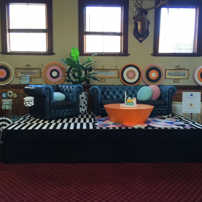
I have spied lambs and seen glimspes of blossoms and to me that means spring!  Spring also means time for change, a re-vamp in your interiors and my pals at Dulux have again come up with some serious Spring inspiration!

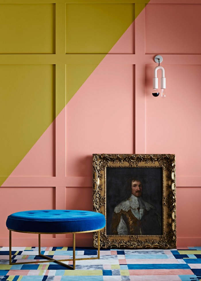
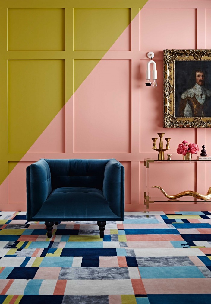
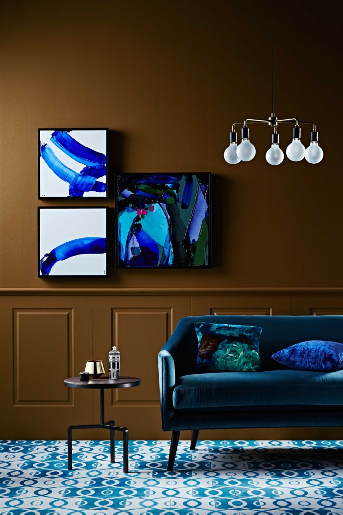
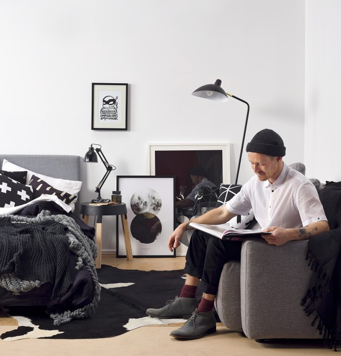
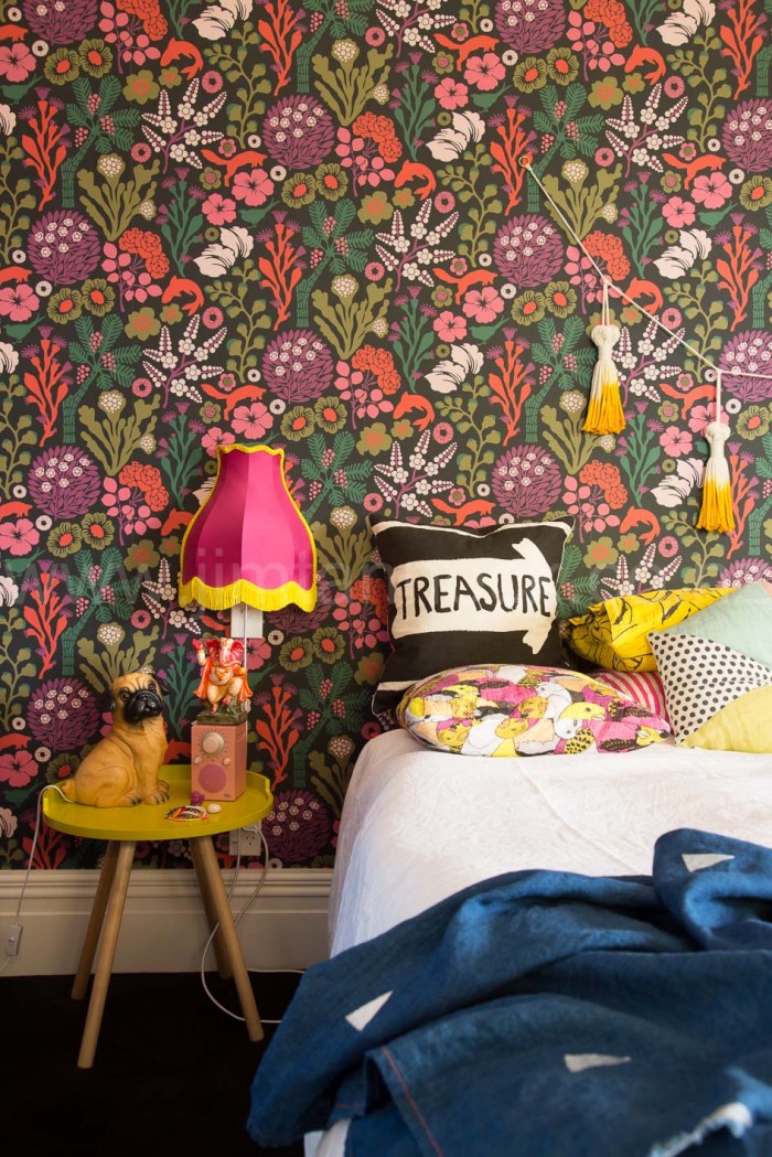
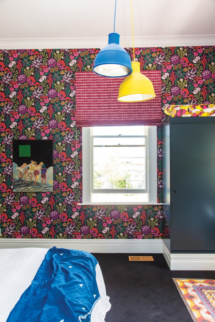
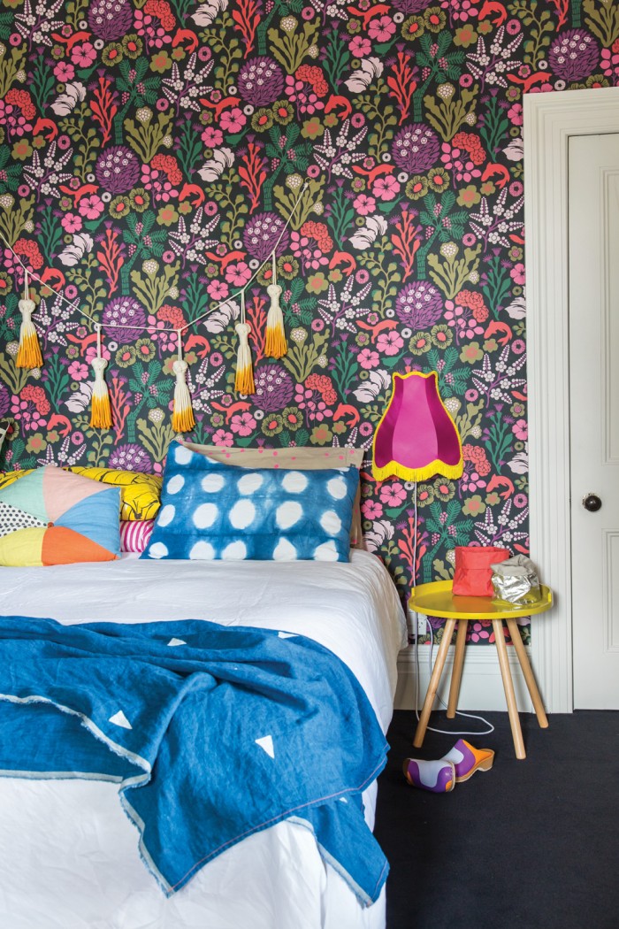
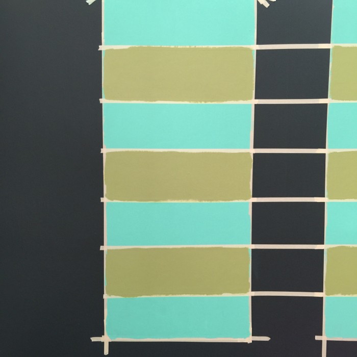
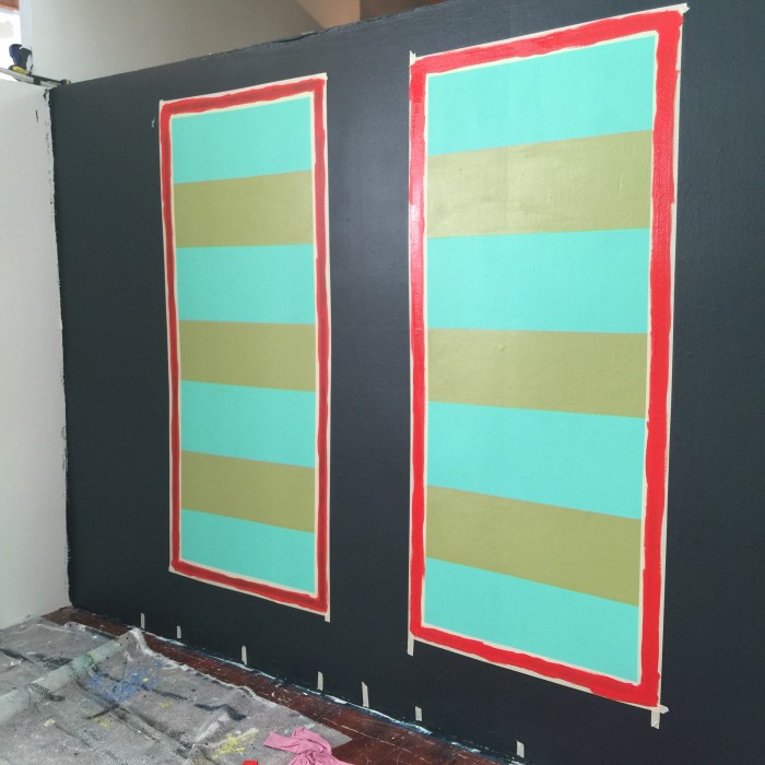
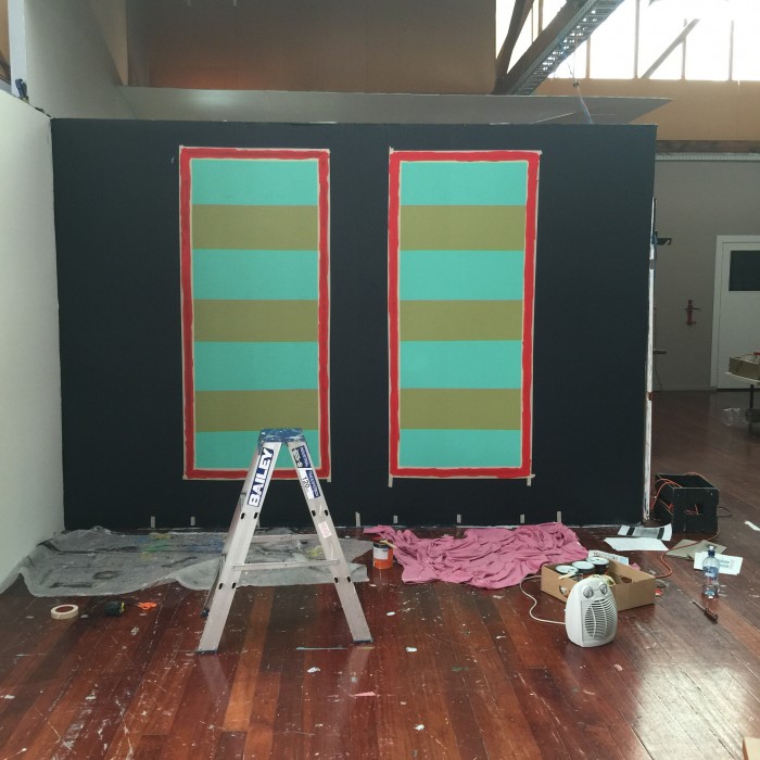
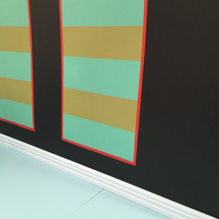
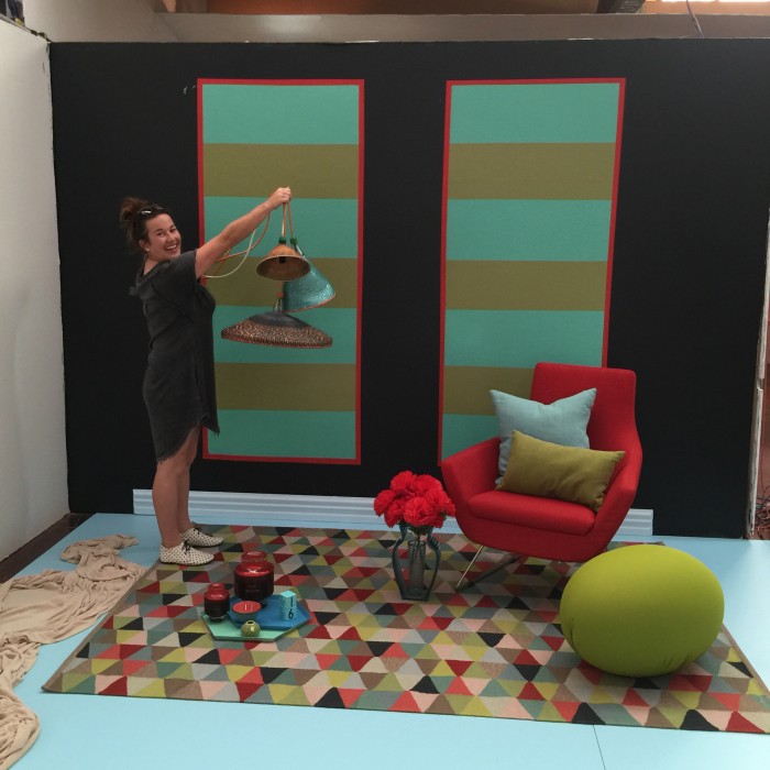
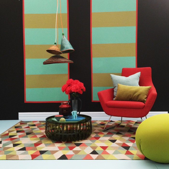
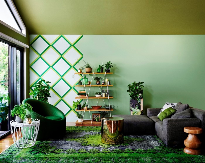
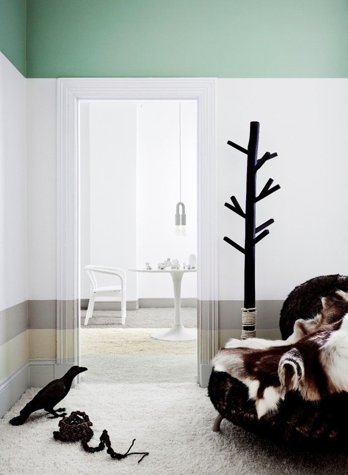
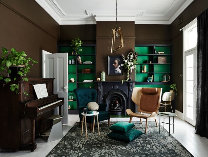
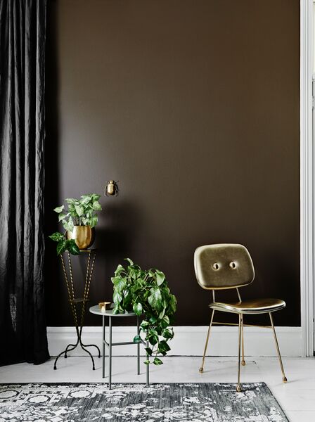
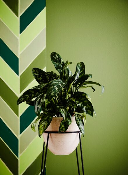
You won’t find muted pastels or traditional spring hues here – no sireebob – this palette is earthy, strong and has a touch of the masculine vibe that is unexpected but darned cool.  It’s literally bringing the outside in, making tones of brown and green the hero colours.  Accents of metallics, multi-tonal wood and lush leaves give this mix of colours a modern vibe and some voom voom cool factor.

V9gHhOaXgPkAMna9ZjPigs5S0O-71Pj-oMDnLOvli4o,8CuKi0qAVYxzJoMtiK5_KtprwHHX9HC9ZLcsi6uhiiE

c3iDpshPKTttpFAz2GdxmBwOEMoQgQ-TIskBl7DwzfA,N1-OqRxATuvNEBmPWVxK5v3vaQFTtqaHpSWOXCr-i90,-KX-EUeN6_LV1ALCk1hEwgCCdipz64I18G09d9WxE6s

rYGEaAaZF0GKHeOGwrNCQlmYEjewR0Q3coTzM94YVkw,4F4vjjkqP0UcvNuabhfvUmpZMS7vlW-MzoHWk2AsjyU

wlNVfS7tgxO4bhd6nzyeo-75QUi9G-AyzVZtMLcz0dU,MYpwNpB5nNKGqa4s17cR064zdF1os8Jm3_mYHhoO138,PwZwMKr2r3EEfsczHEKWr4Wh1BdYAxIvpPowlPALjP4

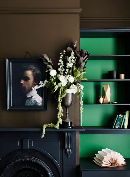
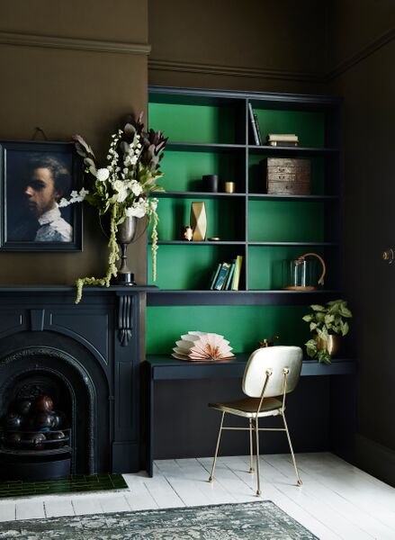
“Think about a formal room or a casual sanctuary and create the mood of a library or space to escape,” Dulux Creative Consultant and Stylist Bree Leech says. “The ambience won’t be strictly traditional in style; but rather will have a sophisticated mix of old and new items, with plenty of plants to bring nature inside.”

Bree Leech, who is the creative marven behind these images also had these pearls to impart:

Style tips for spring 2015 from Bree Leech, Creative Consultant and Stylist for Dulux 

• Create a stylish, sophisticated and moody feel by pairing brown with a limited palette of neutrals, such Dulux Rawene and Cardrona.

• Add a highlight of green to brown schemes to lift the mood and provide a point of interest.

• Green and brown are great together but choose one as the hero and the other as a support. Colours can be lost when applied in equal amounts.

• Brown is a nostalgic colour; keep it contemporary by mixing nostalgic pieces, such as art and antiques, with modern furniture, lighting and accessories.

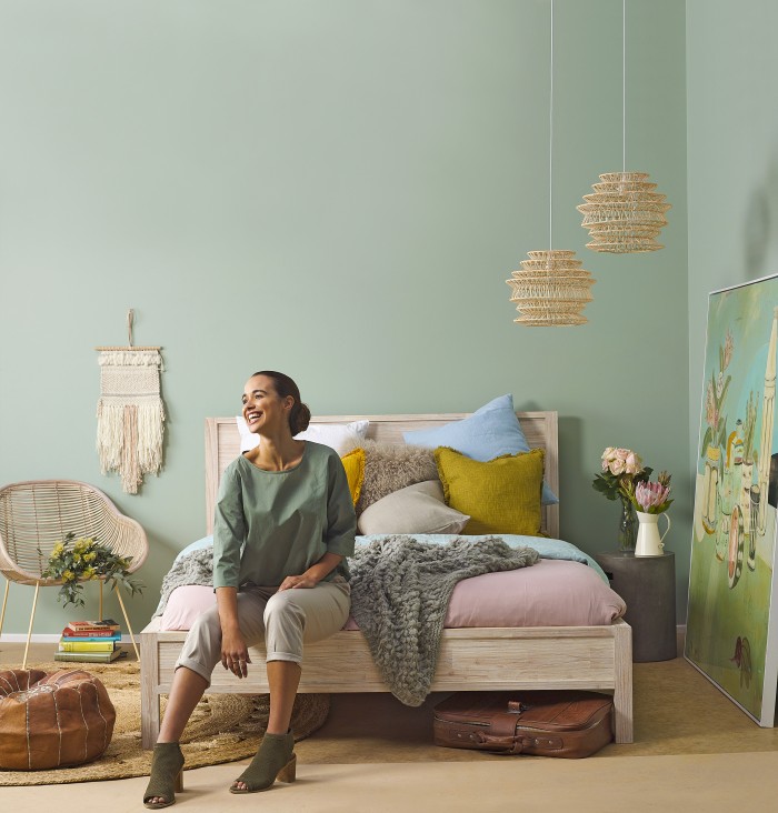
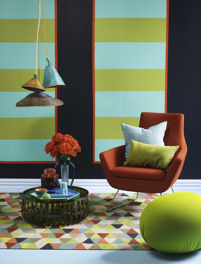
• Adding a touch of pink to an all-green colour scheme can give it a modern edge and draws on inspiration from spring blooms.

• For a touch of luxury, add metallic highlights of gold and brass.

On-trend interior colours for spring 2015 

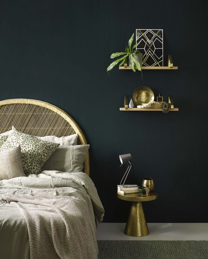
Rawene: The perfect charcoal or “near black” which works with many other hues and can be used anywhere inside or outside the home to create a moody ambience.

Herald Island: A dark deep mesmerizing brown perfect to enhance a living room or bedroom and inject a warm sense of nurturing and security.

Shotover Street: A gorgeous deep green perfect for casual and formal living spaces, as well as bedrooms, which works well alongside browns, beiges and soft blues and greens.

Kopu: An earthy green that will enhance any space in the home and will naturally project the feeling of relaxation and tranquility.

Cardrona: A crisp, clean contemporary white that will feel fresh and bright and will present underlying warmth.

Longwood Forest: This mid based green has a slight yellow/green undertone which schemes well with natural, earthy colours such as deep browns, charcoals, stones and burnished oranges.

Find all the above colours over at Dulux online HQ here

Credits: Styling by Bree Leech and Heather Nette King with photography by Lisa Cohen for Dulux

2 comments

AFD Featured: Homestyle Magazine Colour Issue Aug/Sept 2015

0W1A2200

I know you shouldn’t read comments on facebook, and I usually just box on with my own design style and colour combinations but for some reason, with this room I did.  “Migraine inducing space” was the three words that stuck… not all the positive feedback and lovely comments – no, it was someone’s comment about my bedroom being ‘head-ache material’ that stayed with me.

Now, this is no science experiment, but having lived, sleep, chillaxed as well as conducted the odd yoga session I can hand on heart tell you that there has never once been a migraine produced or induced whilst dwelling in said room.  Infact I would go so far to say that this room is relaxing, a delight and one of my favourite in our house.  My husband backs me up 100%.

hsm_Alexbed2 hsm_Alexbed3 hsm_Alexbed4 hsm_Alexbed5 hsm_Alexbed1

Homestyle backed me up too and we were delighted to be featured in their Aug/Sept 2015 colour issue.  Grab your copy to get some insider tips on choosing pattern rich wallpaper and how to mix pattern with pattern.

You will also enjoy my friend Anya Brighouse’s colourful home and all the other good bits in-between.

Enjoy!  (Headache free I hope!)

Credits and Product info below.

1437630193259

Cover shot: Melanie Jenkins from Flash Studio

Alex Fulton’s Bedroom shots: Jim Tannock

Featured products:

Wallpaper Hanna Werning for Boras Tapeter

Blue Tallboy from Tim Webber Design

Denim Throw and White Linen Duvet Cover from Father Rabbit

Pug Light from Tea Pea

Pillowcases from Kip and Co LetLiv

Wall hung Pink and Yellow Lights from Catherine David Design

Roman Blinds in Shibori from Scion Malcolm Fabrics

Rubber Pendants in Yellow and Blue by Muuto from Bauhaus

Uashmama Bags from Mintsix

Rug from Big Save

Green Tolix Stool from Madder and Rouge

Joinery designed by Alex Fulton Design by Nazareth Joinery

Dulux Colours: Dulux Red Clown (Red/Orange), Dulux Deep Storm (Navy), Dulux Shotover Street (Green) and Dulux Napier (Dark Pink)


4 comments

New Project: Marlborough Book Festival 2015

IMG_2747

For the second year running I have been involved in the design ‘theme’ and set-up for the Marlborough Book Festival / it’s a pretty open brief and always fun working with super arty Kata Vavasour and crafty-mumma Mands Jones.  These two just make it happen.

IMG_2748

Each year we have to turn the character rich ye olde halls of The Blenheim Club into a venue suitable for 9 of New Zealand’s contemprary writers and 1 documentary maker.

This year we went with the theme of ‘targeted reading’ using a delicious combination of Dulux* colours:

Okarito (White)
Taihape (Black)
Dashwood Pass (Caramel)
Mavora (Mid Gray)
Cook Strait (Ocean Blue)
D’urville Island (Seafoam Green)
Morison Bush (Light Green)
Moorhouse St (Orange)

* special thanks to Dulux as all the paint was donated free of charge

IMG_2749 IMG_2751 IMG_2753

IMG_2710


IMG_2754

IMG_2708

Kate asked her wee students to ask what reading means to them… super cute.

The stage used products from the AFD Store – tying in the colours that were used in the targets.

IMG_2750

IMG_2745

Photography: Alex Fulton via iPhone 6 Plus

No comments

Behind the Scenes: Your Home and Garden Colour Shoot May 2015

YHandG Colour Shoot Alex

YHandG-Colour-Shoot-Tanya

YHandG Colour Shoot Alex Walls

This is styling heaven.  Shelley (Managing Editor) from Your Home and Garden asked if I would style a room with a one word brief – COLOUR.

Three of us were asked, myself, Alex Walls (aka Alex and Corban from the Block NZ) and YHandG’s very own inhouse talent Tanya Wong.

It took about half a second to say yes – it was one of those don’treallyhavetothinktwice-nobrainer-derrrr-ofcourse-YES’s.

For such an open brief I had to open my mind – almost imediately an image came to me, an image I had seen on instagram of a truck in india.  These colours painted on the side of a truck had ignited a colour spark…

IMG_0640

My next call to action was to grab my trusty Dulux New Zealand fan deck out of my pink pleather, bedazzled hip holster (no not really but how good would that be). Colours were easily chosen and the plan grew from there.

IMG_0646

A few phone calls to suppliers and a day whizzing around the streets of Auckland and I was ready to paint and style like a women possessed.  It’s full immersion with a limited timeframe on set at the awesome Flash Studios and it’s at this point you think “Right, let’s get this out of my head and make a set!”.

My sketches were my starting point and we started by taping out my panels.

IMG_1801

IMG_1799

IMG_1803

Painters tape was our friend and the trick to get some nice crisp staight lines.  Some tiny bits of paint did manage to sneak over my lines but that was quickly fixed with some touch-ups!

IMG_1805

Dulux Colours used:  Red Trim is Dulux Colombo St / Main wall colour is Dulux Piha / Stripes are Dulux New Plymouth and Dulux Ashhurst / Wooden Floor painted in Dulux Lake Unknown / Skirting painted in Dulux Hanmer Springs

IMG_1807

Before (above) and after (below) – YAY!

IMG_1816

And now for the magic of styling and photography…

IMG_1815

IMG_1814

The room is held together by these.

IMG_1812

IMG_1810

Oohhh and look who happened to pop along for a nosey – only my very own little sister from another mother, Julia from Studio Home!

IMG_1809

And done.

IMG_1818

Professional Photo credits: Melanie Jenkins from Flash Studio

iPhone credits: Alex Fulton Design/Julia from Studio Home


Product credits:

Red Fake Flowers: Fulsun 999 Dominion Road

Backhouse

Olive Foot Stool:  Tato by Baleri Italia $998

Olive Coffee Table:  Panier by Kartell $552

Blue Vase:  I-Shine by Kartell $245

Hanging Trio Pendant Lights:  PET Lamps from $433

Madder and Rouge cushions

Sage rectangle 50 x 30 $110

Celadon 50 x 50 $155

Jester Rug Armadillo & Co from The Ivy House 1.7m x 2.4m $1070

Simon James Concept Store

Hay Tray xtra large mint from $164

Hay Tray large blue from $118

Tim Dixon Elements Candle ‘Fire’ $347

Arne Jacobsen Design Letters Wooden Cubes Set of 10 $107

Pottery by Fran McQuire – POA

Sleigh Chair from Freedom Furniture $599

1 comment

Happy 13th Birthday Abi Hone

IMG_1646

You would have been 13 today.  I guess you are 13 today.  Our beautiful girl.

Every day since we lost you, you are in our minds – how can you not be when you have left a legacy of colour, beauty, love and laughter behind.  All symbolised by Abi’s Dots.  You would love these dots Abs… they are everywhere, put there by everyone ,all helping us to remember to celebrate life and that we only have one wild and precious life.

Today is your birthday but it’s just like any other day becuase you are not here.

As your godmother I would have wanted you to know some things (and it would have been my duty!) and since you are not here I will share these things with the people that are here, all those beautiful young women and men that follow my instagram feed and my facebook page because of you.  These are things I shared with a group of Rangiruru School Year 13’s earlier in the year.  It’s about not being scared, not being normal and being amazing.

+  I’m not scared because I know I can control my own life and cope with the tough times.  Life is always going to throw you curve balls but the difference from ‘before’ to ‘now’ is that I wake up and say it’s going to be a good day.

+  I’m not normal because I follow my own path.  It’s not always easy but I’d rather be on this path than the path of anyone else.  It’s a rocky path at times but it’s still my path.

+ I’m amazing.  I’m amazing because I’m me and you are all amazing because you are you.

You were amazing Abs, you are amazing and I’m wishing you the happiest birthday where ever you are – Love you.


6 comments

Good Prods: Armadillo & Co Rugs

IMG_9223

The good rug folk at Armadillo & Co have done it again – another client and another rug vision comes to life.

IMG_9226

Not only do these guys have a pretty tasty range of ‘off the rack’ rugs, they can help you to customise a rug (size, colour and pattern) to suit your environment. With this job, the brief was to make a hallway runner to fit the space, it needed to be colourful but not overpowering and it needed to compliment the modern architecture.

I marked out 5 sections in 5 colours to divide the rug into spaces that connected with the openings coming off the enterance into a hallway, a kids room and the living space.  The effect is lovely – each view of the rug gives a different colour combination and adds interest to a simple space without drowning it in over-powering hues.

Happy client and happy designer.

IMG_9227 IMG_9228 IMG_9224 IMG_9225

I also have to say a huge thank you to Annie from The Ivy House who is the supplier of Armadillo & Co here in New Zealand – she really is A1 and is a positive, professional and passioniate person to deal with.  Thumbs up everywhere!

We also stock some of the Armadillo Rugs and can get anothing from there range in for you in our AFD Store afdstore@alexfultondesign.co.nz

No comments

Sneak Peak: Dulux Colour Forecast 2015 and Preview Launch Party

Dulux 2015 CF Silent Shift Dulux 2015 CF Mod House Dulux 2015 CF Earthwerks Dulux 2015 CF Wildland

Boom.  Here they are!  A sneaky peak at the four new Dulux Colour Forecast 2015.  Each of the four different ‘looks’ have been styled with the help of some very talented designers.  Edwards Moore, Bonnie and Neil, Heather Nette King and Bree Leech.

Cleverly curated to bring to life to a choosen palette, there are some very niffy ideas for us design-heads to be able to bring some of these saucy shades to our own homes.  The four palettes are called:


Wildland

Silent Shift

Modhaus

Earthwerks


Each beautifully drawing on up and coming trends but still lending themselves to be used for years to come.  For me there is usually a clear winner, but with these four hottie forecasts it’s been very hard to choose a favourite!

As part of this new forecast I got to speak at a Preview Lanch Party held at the stunning venue Mildred & Co.

CF Launch 2 CF Launch 3 CF Launch 4 Cf Launch 5 CF Launch 6

This space never fails to impress and it was very stylishly decked out with the new designer series fan-deck art work that Dulux has recently comissioned.  3 local artists were chosen to design a cover for the new Dulux fandecks and their stories can be seen here (Video Production and Design by InHouse and Sound Track by Dean Foster):

Exciting stuff ahead for us colour junkies / keep your eyes peeled at the Dulux Facebook page and my page for new forecast images.

All images supplied with permission from Dulux New Zealand and Alex Fulton Design


3 comments